AI Summary
To improve ikas store conversion, focus on product page hierarchy, mobile shopping, trust messages, cart clarity, filters, campaign placement and data-based iteration.
Let's Talk!ikas Conversion Rate Does Not Grow With Traffic Alone
If your ikas store gets visitors but sales do not grow as expected, the problem is often not the amount of traffic. It is the shopping experience that drags ikas conversion rate down. A visitor can leave because the product is hard to understand, the add-to-cart button is not obvious, delivery information is missing or the cart flow does not feel trustworthy. This guide explains seven design areas that directly affect conversion.
The goal is not to make the store more decorative. The goal is to make buying easier. Clear product value, a smoother mobile experience, visible trust messages and a shorter path to checkout can all help the visitor make a decision with less hesitation.
1. Make Product, Price and Action Clear Above the Fold
When a customer lands on a product page, they should quickly understand what the product is, how much it costs and what to do next. If the title is too long, the image pushes the price too far down or the add-to-cart button is hard to find, the user becomes tired before deciding.
Product title, price, discount, variant selection and add-to-cart action should form a simple hierarchy. On mobile, this matters even more because screen space is limited. A clear button text such as “Add to Cart” often works better than creative but unclear labels.
2. Use Images That Sell, Not Just Images That Look Good
In ecommerce, customers cannot touch the product, so images do a large part of the selling. One studio image is rarely enough. Show details, scale, texture, use cases and real-life context. The more questions your images answer, the less hesitation the customer feels.
Your product gallery should be easy to swipe on mobile, fast to load and clear when zoomed. For fashion, accessories, cosmetics, furniture and home decor, image quality directly affects perceived value. A weak image can make even a strong product look cheap.
3. Place Trust Messages Where Decisions Happen
Before buying, customers ask small but important questions: When will it ship, can I return it, is payment secure, is this product original, can I get support? If these answers are hidden, the visitor leaves the product page to search elsewhere, and that often breaks the purchase flow.
Shipping, returns, secure payment, support, warranty and installment information should appear in short, readable blocks. These messages should build confidence without making the page crowded. Small badges, short copy and expandable detail areas usually work well.
4. Remove Friction From the Cart Flow
Adding a product to cart is not the same as buying. If the cart creates a pricing surprise, hides shipping information or weakens the checkout call to action, the customer can still leave. The cart should help the customer complete the decision.
A mini cart, free shipping threshold, clear total price, trust messages and a strong checkout button can improve the flow. If the customer is close to free shipping, showing that message can also support average order value. Keep it clear and avoid turning the cart into a campaign wall.
5. Improve Mobile Menu and Filters
If customers cannot find the right product, they cannot buy it. As the catalog grows, filters, sorting and category hierarchy become conversion tools. On mobile, filter access must be visible and easy to use.
Filters should match the product category. Size, color, price, brand, material or use case can all matter depending on what you sell. Product cards should also be clear, showing image, price, discount and important variant information without visual noise.
6. Keep Campaign Messages Clear
Campaigns can increase sales, but too many banners, pop-ups, counters and badges can make the store feel chaotic. Good campaign design is clear, measured and placed in the right context.
Use broad campaign messages on the home page, category-specific offers on collection pages, product-related advantages on product pages and final decision messages in the cart. Every message should not shout at the same time. The customer should understand the offer while still seeing the product value.
7. Do Not Redesign Without Measuring
A common conversion mistake is making decisions based only on personal taste. Which page causes exits, which device drives traffic, how many product views turn into add-to-cart actions, where does cart abandonment increase? These questions need data.
Use analytics, Search Console, heatmaps and ikas sales data together. Start with the pages that receive the most traffic. Small but well-targeted changes can perform better than redesigning the whole store without evidence.
Conclusion: ikas Conversion Rate Lifts With Less Friction, More Trust
There is no magic button for increasing ikas store conversion. But clearer product information, smoother mobile shopping, visible trust messages and a simpler cart flow create a strong foundation. If visitors quickly understand what they are buying, why they should trust you and how to complete checkout, conversion becomes easier.
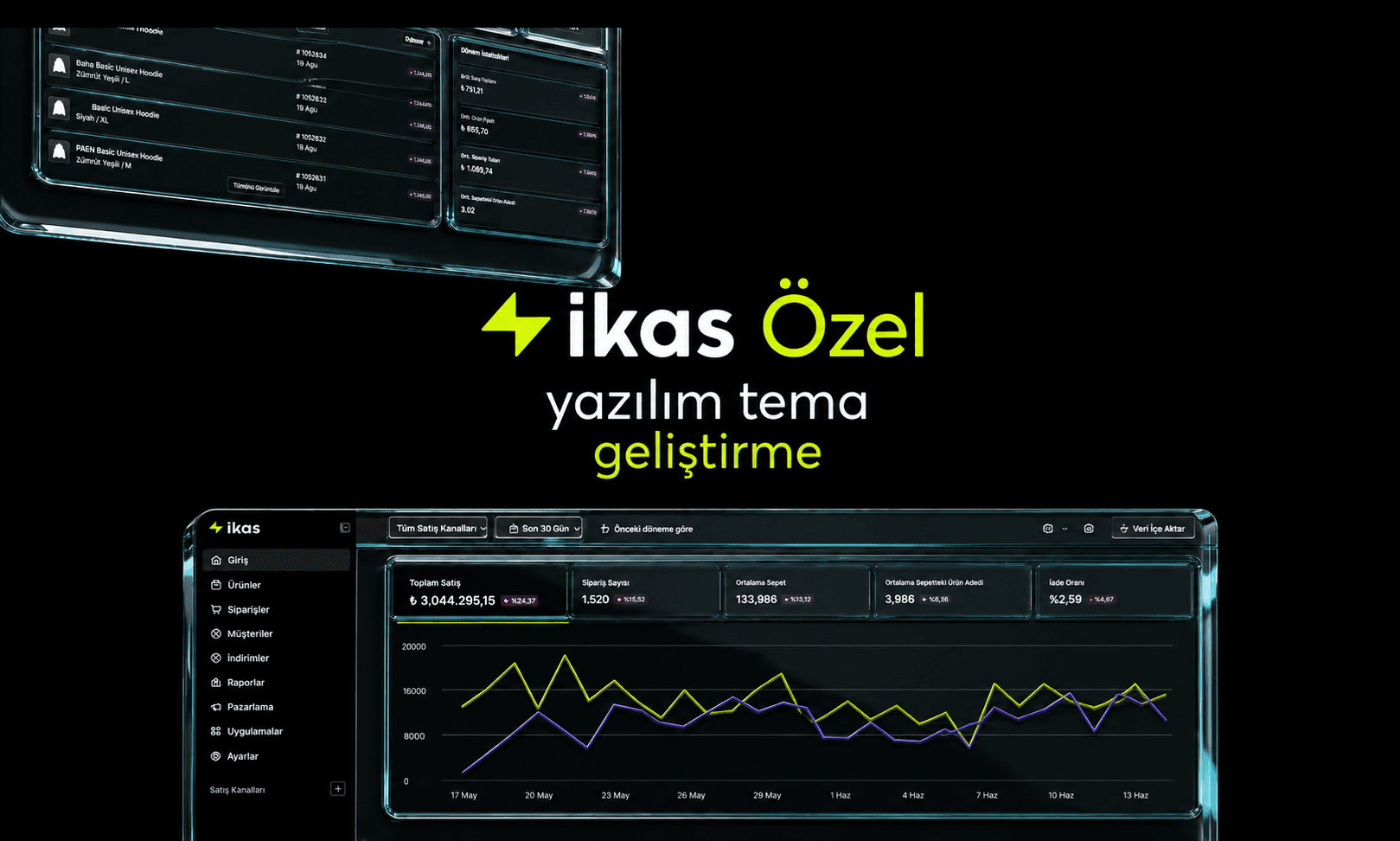
If your current theme limits these improvements, an ikas theme design or custom ikas theme project can help create a more conversion-focused storefront.
A 30-Day Action Plan for ikas Conversion Rate
You do not need to improve everything at once. In the first week, review the five product pages with the most traffic. In the second week, simplify mobile category and filter experience. In the third week, improve trust, shipping and total price messages in the cart. In the fourth week, measure the results and roll out the best-performing changes to more pages.
This plan may look small, but it helps you move forward without redesigning the entire store in panic. The healthiest conversion approach is to make measurable changes one by one and keep making the store easier to understand.