

We started the Rasquad shopping journey with a collection world, not a product list.
We did not approach Rasquad’s assortment of leggings, tops, shorts, jackets, and skorts like a conventional sportswear store. We brought the brand’s relationship with city life, travel, and active living into the core idea of the store. We built the Shopify theme design around a flow where customers first enter a distinct use-case world and then discover the products within it.
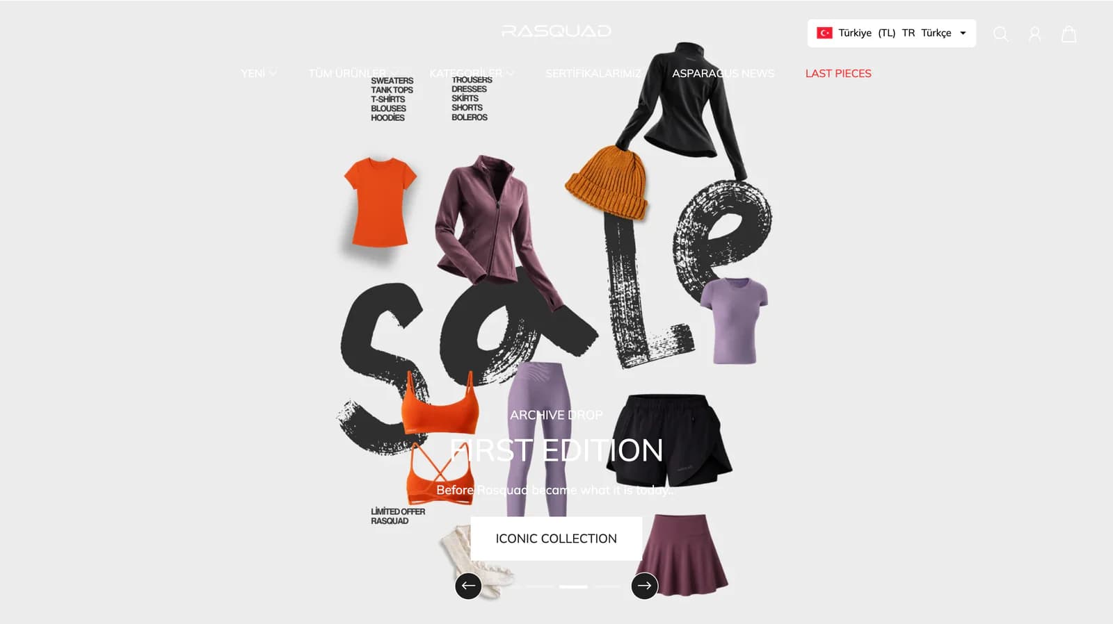
On the homepage, we separated selections such as Tailored Collection, Travel Edit, Archive Drop, Last Pieces, and The Rasquad Edit. Rather than using each area as another showcase for the same products, we gave every section a different reason to explore. Customers can browse the new collection, move into a selection from previous seasons, or go directly to the pieces you want to highlight.
With this approach, we shaped the Rasquad store less like a long catalog and more like a collection space with multiple entry points.
We created an editorial rhythm instead of a dense sportswear layout.
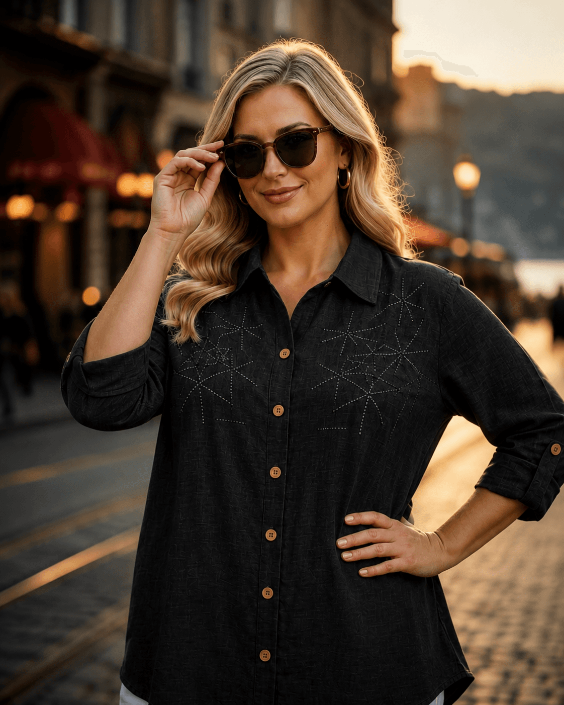
We gave product photography plenty of space in Rasquad’s visual language, kept copy concise, and used spacing between sections deliberately. Instead of stacking large promotional blocks one after another, we paired strong imagery with short headings. This let us preserve the energetic character of activewear while creating a more refined shopping feel.
We used short English and Turkish phrases, collection names, and lifestyle imagery within the same visual system. We distributed the brand tone around city life, travel, and movement across the pages, while keeping price and promotional information visible where needed without letting it overpower the product.
The goal was not only to make the products look good, but also to make the kind of life Rasquad pieces belong to clear. When you want to highlight a new collection or edit, you now have a space where it can be introduced naturally within the store’s existing visual language.
We used The Product Edit to break the broad catalog into more readable paths.
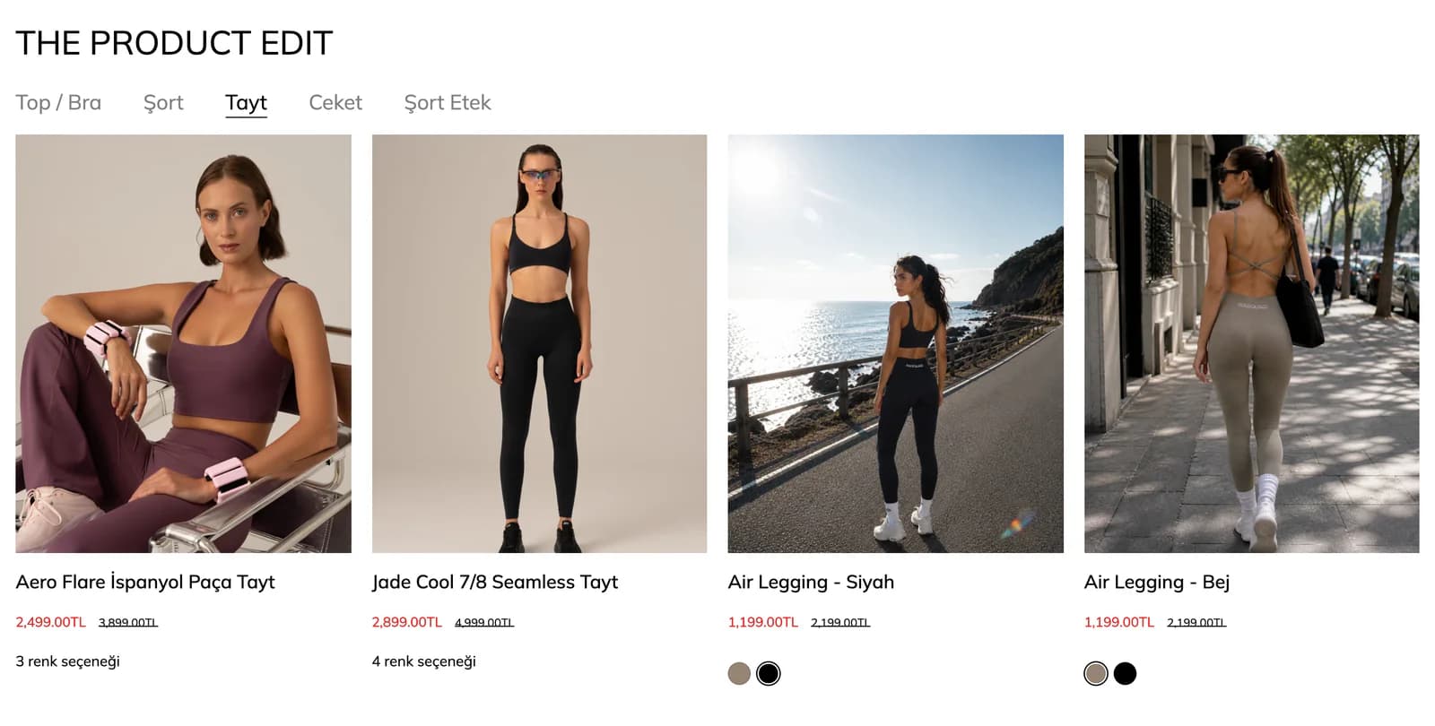
For activewear shopping, we did not expect customers to scan the entire catalog from beginning to end. In The Product Edit on the homepage, we turned core groups such as Top / Bra, Shorts, Leggings, Jackets, and Skorts into separate entry points. This means someone arriving with a specific product in mind can move directly to the relevant group without having to pass through every collection story first.
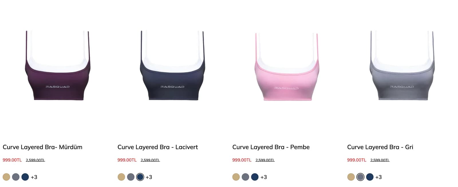
We treated collection pages with the same simplicity. We kept products in a clear list structure, placed sorting options where they were easy to reach, and included the essential information needed for an initial decision directly on the cards.
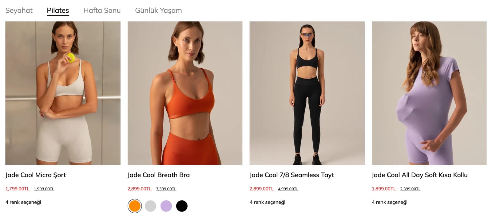
We showed price, any discount, and color alternatives on product cards. If a model comes in multiple colors, customers can compare those options before opening the product page. In this way, we treated the collection page not merely as an intermediate screen, but as a shopping space where the first decisions can already be made.
We brought color, size, and product feel into the same decision moment.
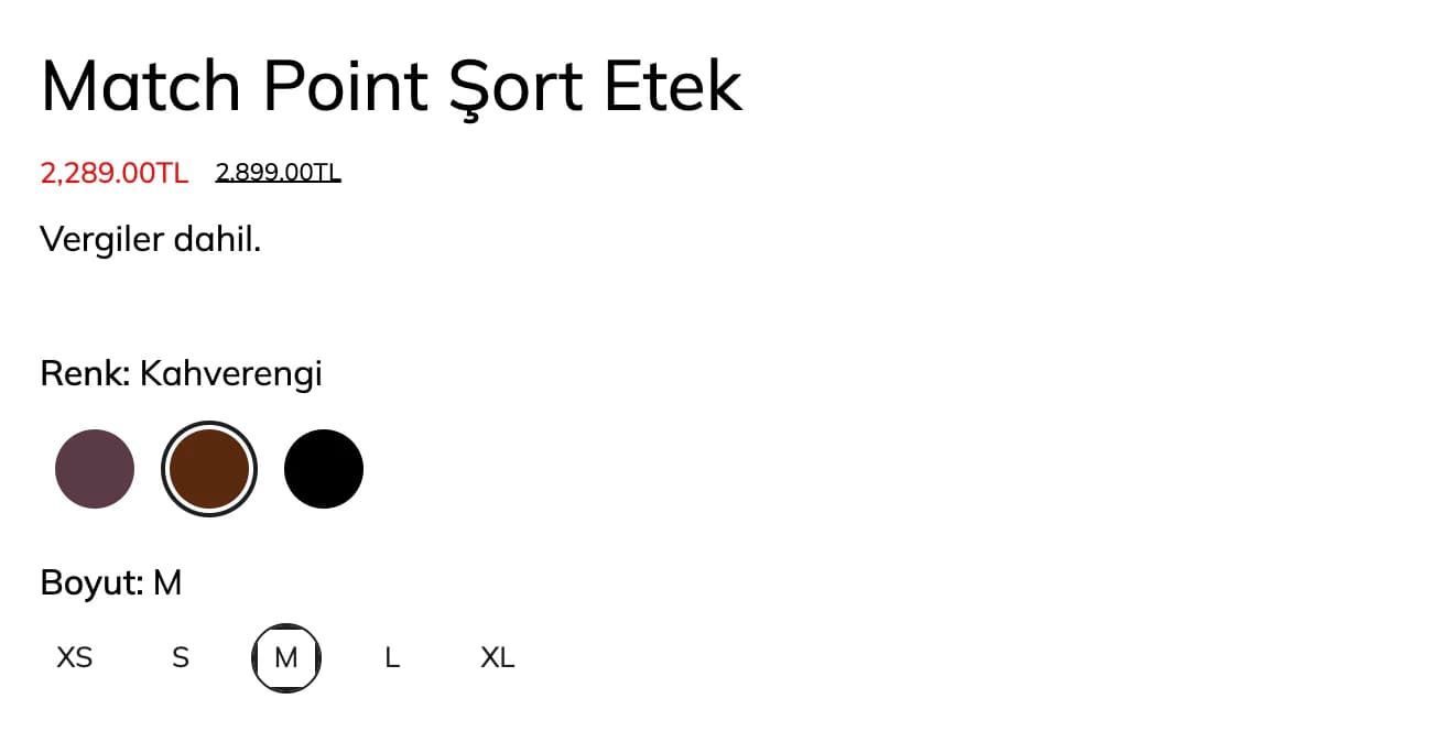
At Rasquad, different colors of the same model and choosing the right size were important parts of the purchase decision. For that reason, we did not bury color and size options inside long descriptions. We kept the selected color, available sizes, price, and add-to-cart action close together in the main product information area.
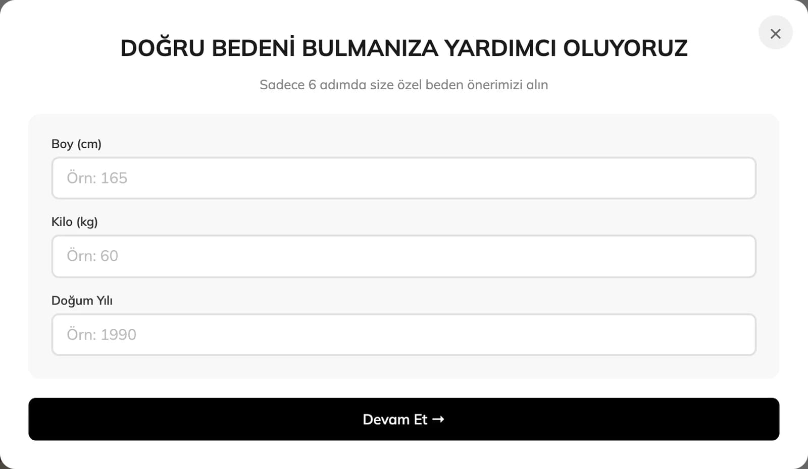
We also kept Find My Size close to the point of selection. When customers are unsure about sizing, they can get help where they are making the decision instead of searching elsewhere on the page.
We made color options visible from the collection cards onward. On the product page, we then organized imagery, colors, and sizes as parts of the same decision. Especially for activewear products with strong visual similarities, we kept this sequence simple so customers can choose the right variation more easily.
On the product page, we followed the photography with the information that actually supports a decision.
With activewear, appearance creates the initial interest, but the purchase decision is completed by fit, fabric, and how the product behaves on the body. That is why we did not compress all product details into a single long description.
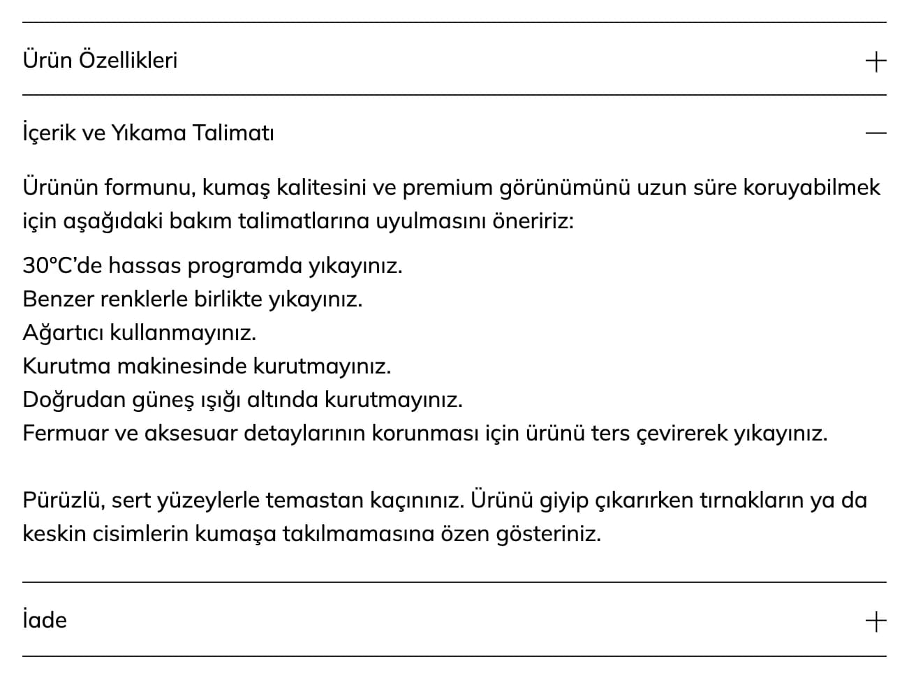
We separated product features, composition and care information, and return details into distinct areas. We created a structure where product-specific details such as scrunch construction, under-glute support bands, anatomical cuts, layered construction, and stretchable, breathable fabrics can be read in detail when needed.
We prioritized the choices required for purchase in the first view and kept deeper details immediately below for customers who want more information. We arranged visual discovery and non-technical product information on the same page without mixing them together. Before buying, customers can see not only how the product looks but also which features it has.
We brought Rasquad’s city and travel side into the shopping experience.
We did not describe Rasquad products only in a gym context. We built sections such as Travel Edit, which supports the Tailored for the city. Ready for everywhere. approach, with large visuals and concise copy. Instead of presenting a pair of leggings or a jacket in isolation, we made room for the relationship those pieces have with city life, travel, and everyday movement.
With Archive Drop and First Edition, we made previous collections accessible again within their own context. In Last Pieces, we brought remaining items into the main flow, while The Rasquad Edit became a place for products the brand specifically wanted to select and highlight.
We did not design these sections around the same promotional logic. We gave each one a different reason to explore. As a result, returning customers do not have to encounter the same catalog sequence every time and can instead move toward a different collection, edit, or product.
We showed discounts without putting them ahead of the brand.
For discounted products, we clearly separated the old and new prices and made the discount rate visible on the product card. At the same time, we did not fill the entire store with price tags and promotional messages.
We gave priority to collection imagery, products, and Rasquad’s lifestyle narrative. In areas such as Last Pieces, where a sales message felt natural, we made the price advantage more prominent. In curated areas such as The Rasquad Edit, we kept the product itself in focus.
With this balance, you can show price advantages clearly during promotional periods while preserving the store’s character within the same structure when no campaign is running.
On mobile, we kept the same sequence from collection to color, size, and cart.
We treated the theme design we prepared for Rasquad as a separate shopping scenario on smaller screens. We preserved large imagery, kept long descriptions away from the first decision moment, and reserved enough space for product selection.
On a phone, customers first see the collection or product, then move to price and color options, choose a size, and proceed to cart. Product features, care information, and return details follow below, ready to be read when needed.
We did not turn the editorial feel we created on desktop into a compressed version for mobile. We reorganized the order between visual discovery, product selection, and detailed reading to adapt the same Rasquad experience to a smaller screen.
In the end, we built a Shopify store for Rasquad that lives through its collections.
We reshaped an off-the-shelf Shopify theme around Rasquad’s activewear products, color variety, and collection language. We treated the homepage not as a storefront for displaying product volume, but as the starting point for different discovery paths extending from Tailored Collection to Travel Edit, Archive Drop, and The Rasquad Edit.
We simplified selection on collection pages, showed colors early on product cards, and placed size and variation decisions at the center of the product detail experience. We carried the brand language spanning city life, travel, and active living into the store’s visual rhythm.
The result was a store that does not confine Rasquad products to a single use case, lets customers begin shopping from the world that interests them, and gives them the information they need at the right moment to make a decision.