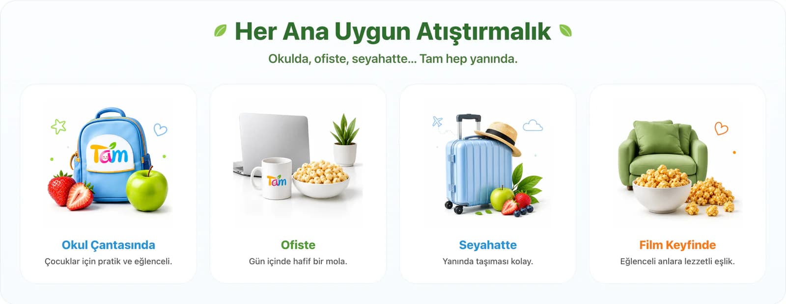


Before the product, we showed where it fits into everyday life.
Tam Öğün’s range extended from freeze-dried fruit and nuts to cookies, popcorn, and corn chips. Instead of treating this variety as a sequence of product groups, we built the store’s main idea around everyday snacking moments.
We paired products with different occasions such as school bags, office breaks, travel, and movie time. We created dedicated discovery areas for product groups such as freeze-dried fruit and popcorn, while giving new flavors a place within the main flow. This way, visitors first notice a moment that feels relevant to them, then move on to products that can accompany it.
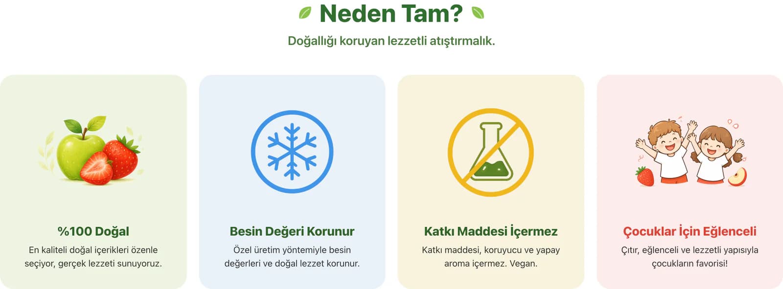
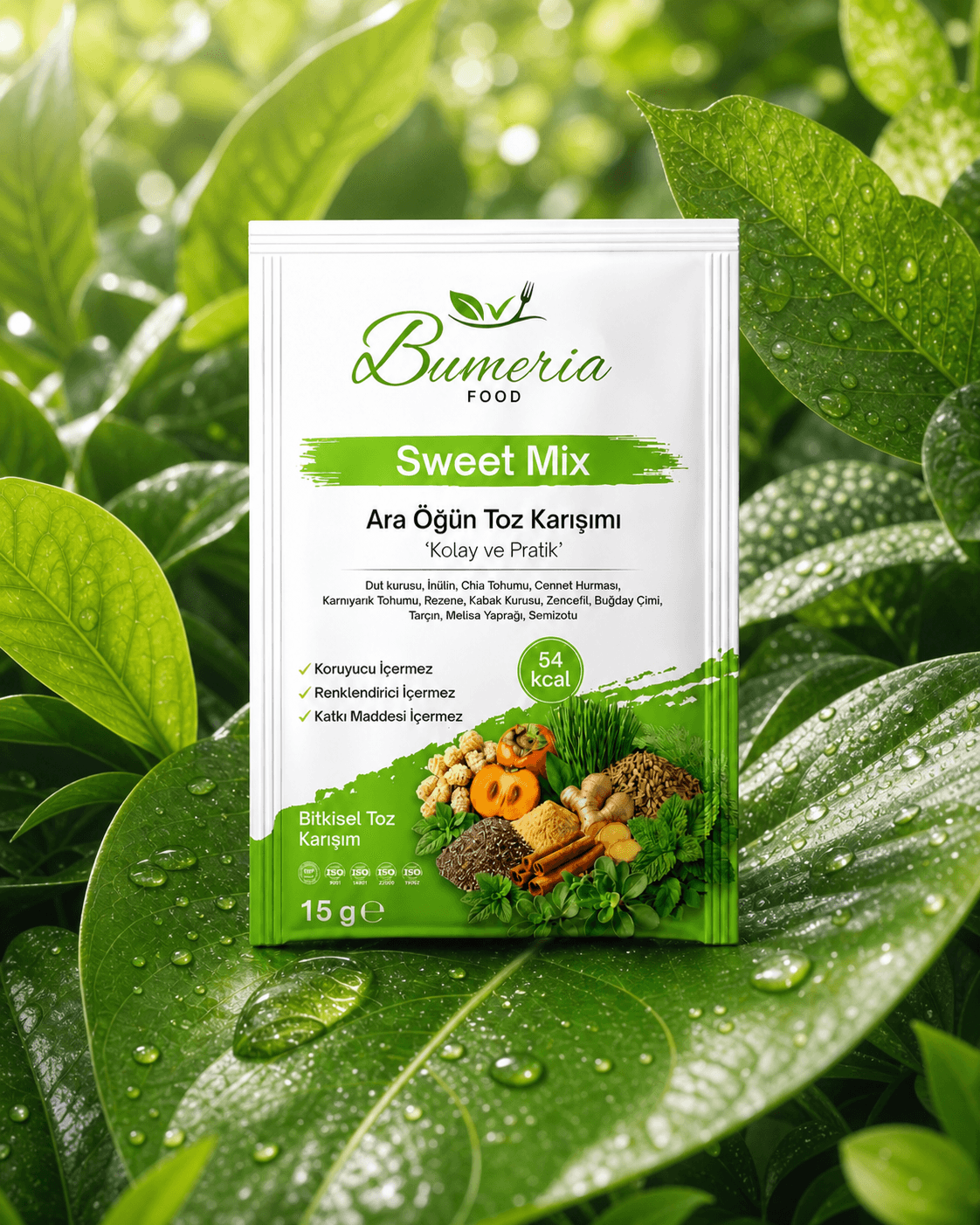
We also avoided squeezing messages such as natural ingredients, no additives, and suitability for everyday consumption between product cards. We gave each message its own space and made the reasons for choosing a product part of the shopping flow.
We brought Süper Anne into the store’s visual story.
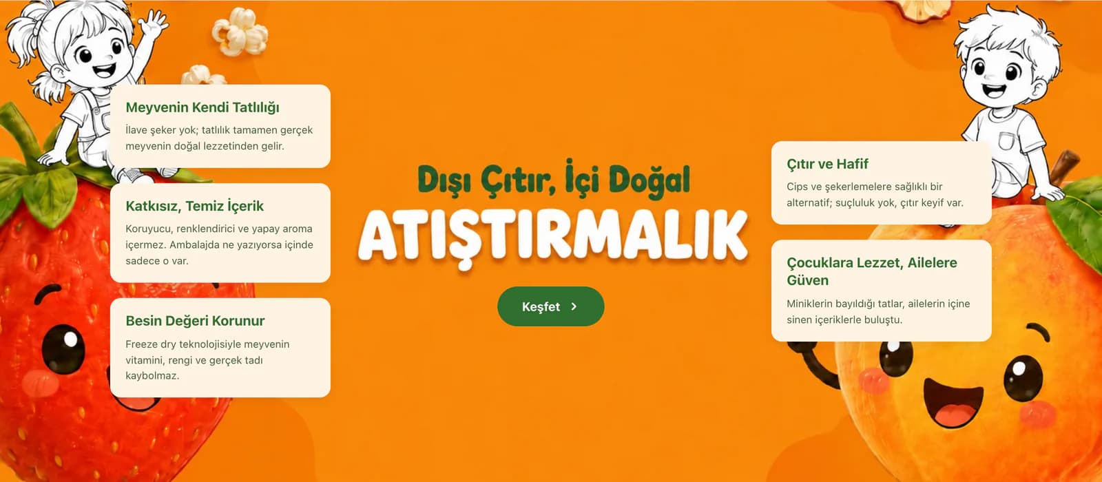
Colorful packaging, playful illustrations, and the Süper Anne character had a strong place in Tam Öğün’s world. While adapting the ready-made ikas theme to the brand, we treated these elements not as decoration but as parts of a shared visual language that continues across pages.
We balanced lively packaging and colorful accent areas with generous whitespace. We created a warm and approachable tone across headings, visuals, and content areas. We kept the communication between parent and child within the same structure without making the natural product side feel overly serious or the child-friendly side overly playful.
We reused the Süper Anne character and the cheerful world of the packaging across different sections. When visitors moved from the homepage to another part of the store, the visual language did not change; the same Tam Öğün character continued throughout the experience.
We designed categories as discovery points, not shelves.
With such a broad product range, instead of presenting everything with the same emphasis, we created different entry points. We separated category areas, featured product groups, usage moments, and new flavors to give customers multiple ways to move through the store.
We brought product imagery forward and kept the cards simple. We maintained the same product presentation across the homepage, product listings, and search. While using the ready-made theme’s core layout, we reconsidered its colors, visuals, and content approach specifically for Tam Öğün.
As a result, someone arriving for a particular product can go straight to what they need, while someone who has not yet decided what to buy can explore different flavors. Product discovery is no longer a process tied only to the category menu.
We gathered everything needed for a decision around the product.
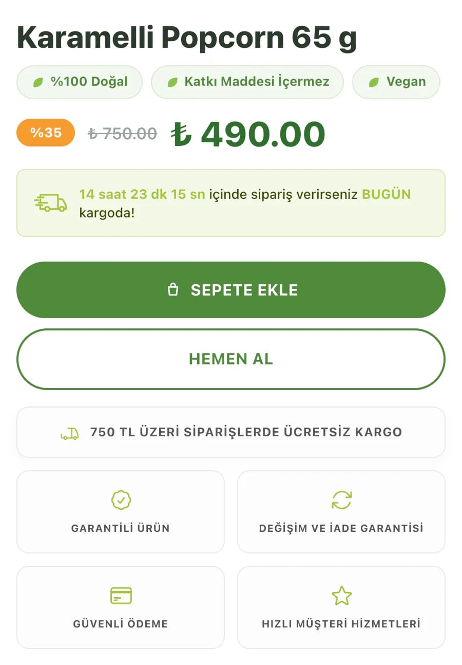
On the product page, we placed shipping information, trust messages, and essential product details around the name, imagery, and purchase area. Information that could influence the buying decision, such as additives, ingredients, and usage, continued within the same flow.
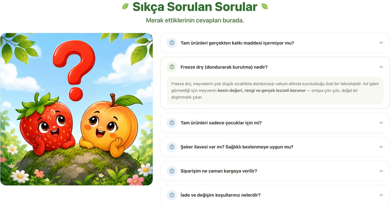
Rather than filling the first screen with every piece of information, we arranged the content in sequence. After the product description, we moved into usage occasions, frequently asked questions, and the brand’s key attributes. With this structure, visitors first understand the product and then continue to the level of detail they need.
On mobile, we also made the purchase area that remains accessible while scrolling part of this decision flow. After reading the descriptions, users can add the product to their cart without returning to the top of the page. We added visual feedback to the add-to-cart action so the result of the interaction is clear.
We placed small moments for getting to know the brand between shopping steps.
We did not think of the Tam Öğün store simply as a showcase where products are sold. We designed usage moments, the Süper Anne character, category transitions, frequently asked questions, and blog content alongside the product areas.
At the end of the homepage, we added an email subscription area for new products and campaigns. We made the blog and frequently asked questions accessible from the store’s overall structure. Customers who want to go beyond the product and learn more about the brand while shopping can reach the content they need within the same store.
This approach was especially meaningful for Tam Öğün because the ingredients used in the products, the moments in which they can be consumed, and the way the brand communicates with families were all part of the purchasing experience alongside the products themselves.
We chose what to keep from the ready-made ikas theme and what to turn into Tam Öğün.
Instead of building a completely new structure from scratch, we kept the core shopping framework of the ready-made ikas theme. We reshaped the customer-facing side of the brand without changing essential areas such as products, menus, accounts, and the cart.
The logo, menus, products, social media links, and core store content remained manageable through ikas. We prepared the visual areas that define the brand character, the content hierarchy, and the product discovery experience specifically for Tam Öğün. This means you can continue managing the store from the same panel without moving to a different system for day-to-day operations.
In the end, instead of creating a design that tried to hide the ready-made theme, we combined its solid shopping structure with Tam Öğün’s own world. From colorful packaging and Süper Anne to everyday usage moments and product details, every major section of the store was tied to the same idea: presenting Tam Öğün products not as snacks sitting on shelves, but as flavors that accompany different moments throughout the day.