
We built appetite before we built the storefront.
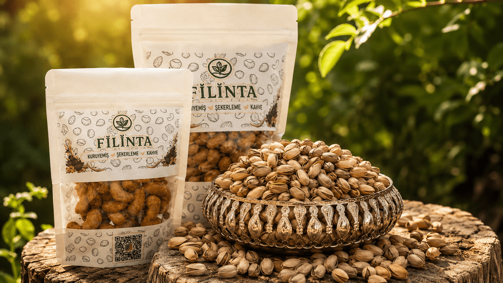
At Filinta Kuruyemiş, the products themselves were the strongest part of the visual design. Nuts, dried fruit, Turkish delight, confectionery and other snacks already created a rich visual world through their colors and textures. Instead of filling the interface with elements that would compete with the products, we pulled it back. We used generous space around imagery, kept the copy concise and arranged different product groups so they could be distinguished easily.
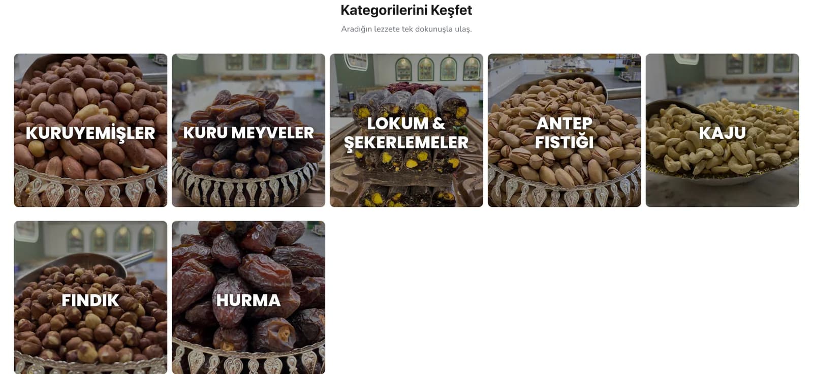
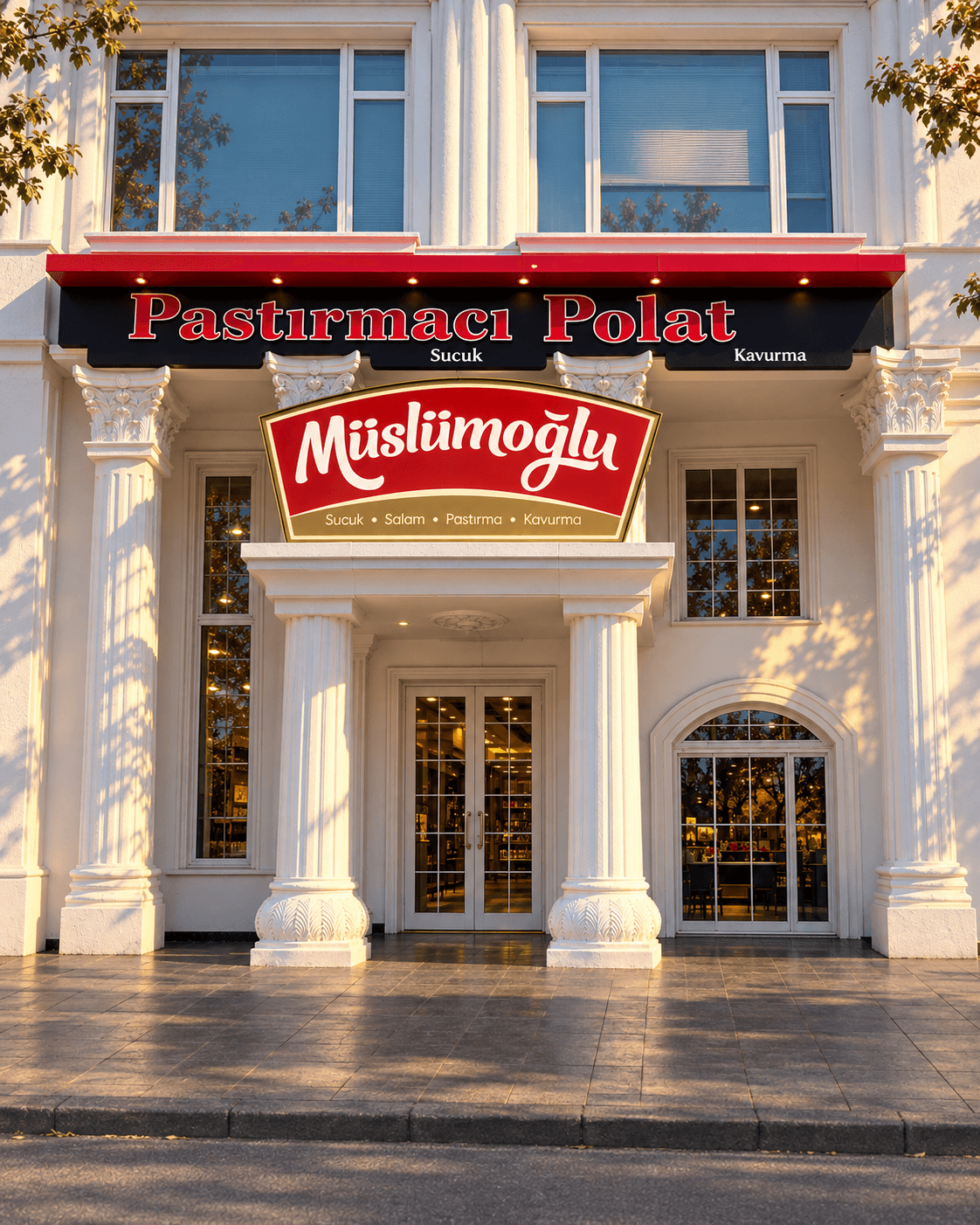
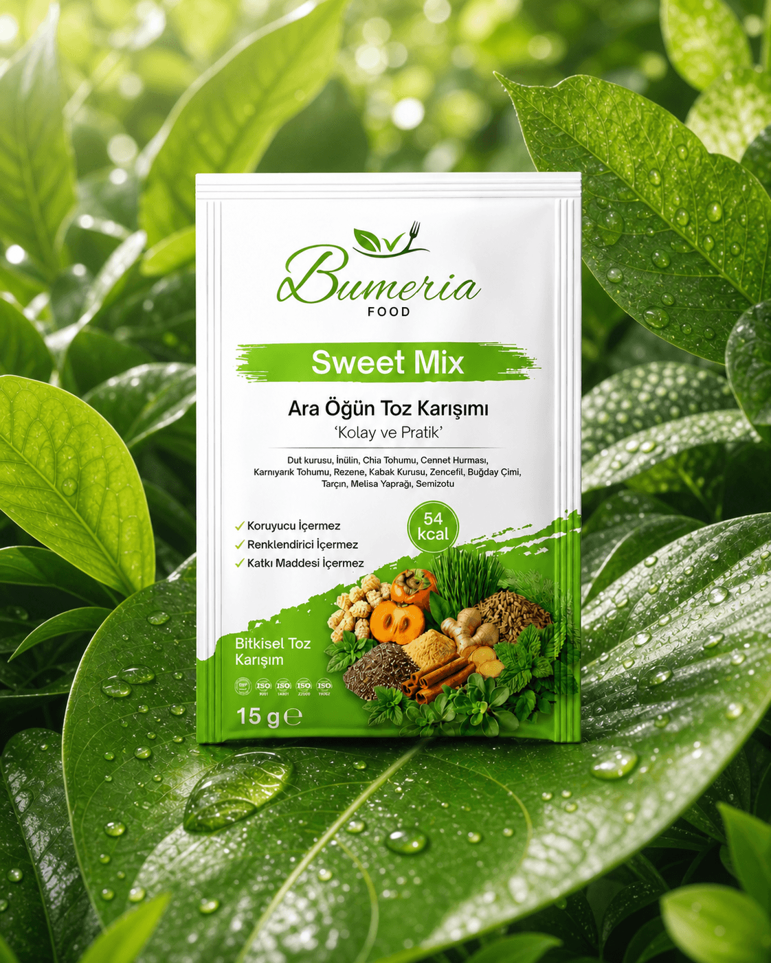
We treated the category covers as part of the same approach, creating them with AI support in a shared visual language. Each cover brought the category name and an image representing that product group into the same composition. The content changed from nuts to Turkish delight, but the store retained a consistent visual character.
We also designed the cover system so the same approach could be reproduced as new categories were added. As the catalog expanded, this prevented the storefront from becoming fragmented through unrelated visuals.
We did not present a wide catalog like one long shelf.
We defined the homepage's first job as helping customers find the right product group before showing them individual products. Categories became the center of discovery, followed by the most popular products connected directly to the shopping flow. Customers first decide what they are looking for, then move into the relevant products.
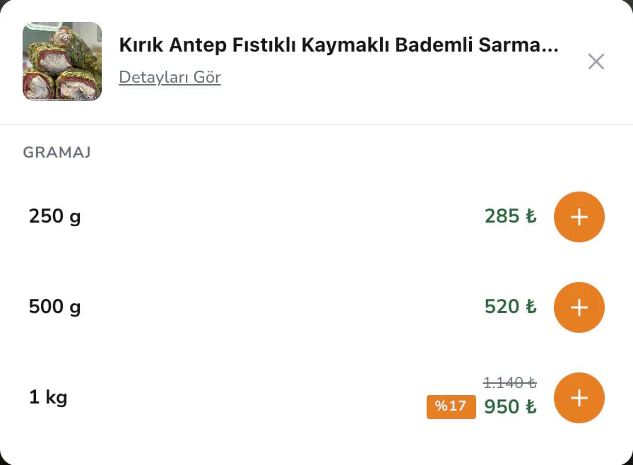
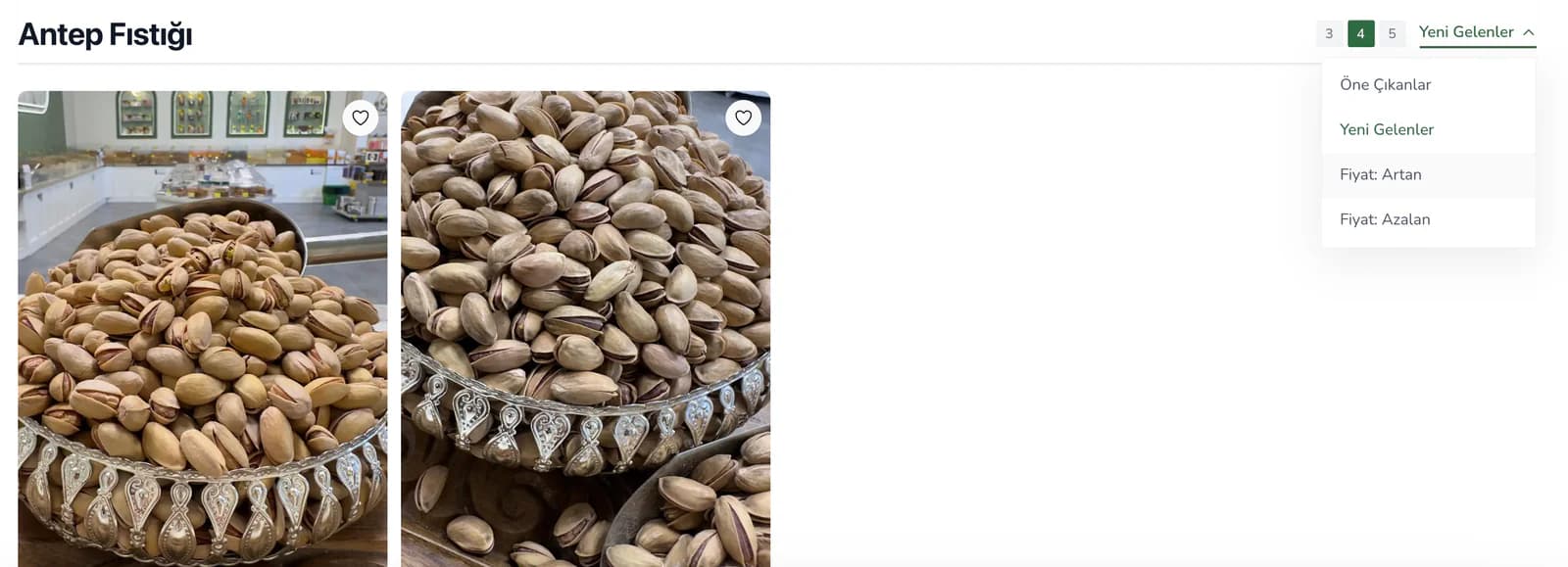
We carried the same logic into category pages. Sorting options remained visible, allowing products to be compared by featured status, newest arrivals or price. We also added direct add-to-cart actions to product cards on the homepage, avoiding an unnecessary extra page for customers who wanted to complete their purchase quickly.
This structure was especially important in a catalog containing many flavors and size options. Instead of making customers browse products one by one, we first organized them into groups, then made comparison easier and placed the purchase step as a natural continuation of that flow.
We put video alongside photography.
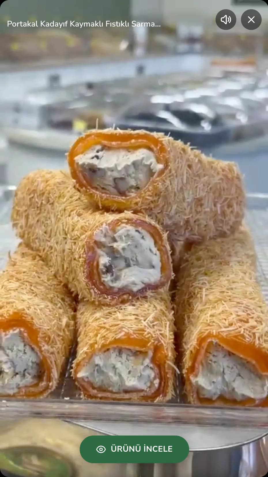
We did not limit Filinta Kuruyemiş products to conventional category sections and product cards. We added a story-style area to the homepage, familiar from social media, and used it as a separate way to discover products through video.
In this section, we integrated motion content into the natural flow of the homepage. It created a dedicated space for a new launch, a flavor that needed seasonal emphasis or a product that was better explained through video. Content that might have disappeared among static product photography could be brought forward in a different format.
We built the story area so new content could be added over time. This made it possible to update this part of the storefront according to campaign or product priorities.
We brought every question at the decision stage into one place.
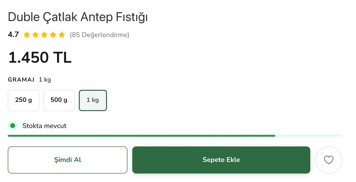
We designed the product page around the idea that the customer had moved beyond discovery and was now making a decision. Product imagery, ratings, price, size options and stock status were grouped around the purchase area. Customers could compare different quantities without having to search across different parts of the page for essential information.
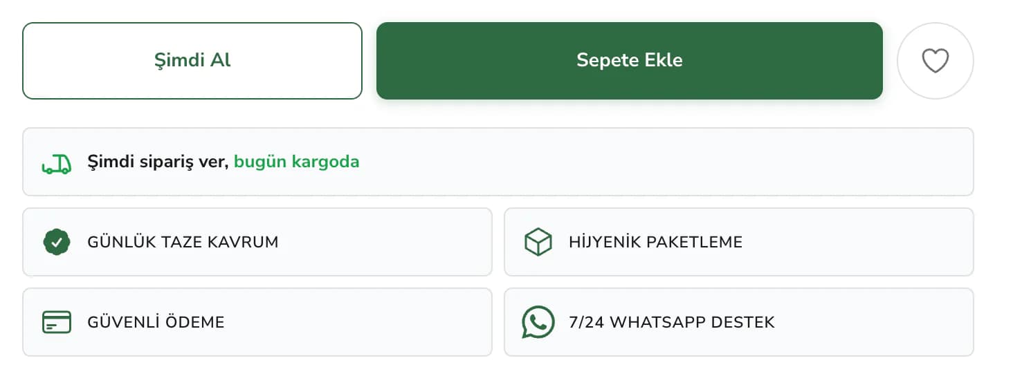
We separated the “Buy Now” and “Add to Cart” actions. Customers who wanted to purchase a single product quickly had a shorter path, while those continuing to shop could follow a separate cart-based flow.
Directly after the product information, we placed trust messages covering daily fresh roasting, hygienic packaging, secure payment and WhatsApp support. Shipping information also became part of the same decision area. This allowed customers to consider not only which flavor and size to choose, but also how the order process would work, all in the same place.
We did not put loading time between the customer and the product on mobile.
We did not treat mobile as a smaller desktop version after the design was finished. We prepared visuals for the areas where they would actually be used, structured pages so only necessary content would load, and kept category browsing, product viewing and the path to cart lightweight.
We handled mobile speed from the design stage onward. We prepared images at the right sizes from the start and made pages load only the content they need. We did not treat these numbers as performance metrics in isolation; the goal was to let customers move between products without waiting, especially on mobile.
For a visually rich store, we avoided choosing between speed and product presentation and instead built a balance that preserved both.
We wanted campaign changes without rebuilding the storefront.
We did not build the Filinta Kuruyemiş homepage as a fixed storefront. We separated category order, product showcases, campaign areas and copy so they could be changed through ikas. During a seasonal campaign, product priorities can be adjusted, different categories can be brought forward and content can be reorganized according to current needs.
We also created a foundation that allowed the same visual language to continue across new product groups. The aim was to preserve the structure established on day one while routine changes were made to the store.
We connected the trust areas around the cart to the same flow.
When buying nuts and snacks, customers do not make decisions based only on appearance and price. Freshness, packaging, payment, shipping and the post-order process also matter. For that reason, we brought secure shopping, cash on delivery, free shipping and daily freshness messages together in a visible section on the homepage.
We also incorporated frequently asked questions, order tracking and essential legal pages as support points around the shopping experience. Questions customers may have before purchasing and resources they may need after placing an order were treated as parts of the same overall system.
For Filinta Kuruyemiş, the result was a custom ikas theme centered on flavor throughout the journey from discovery to purchase, rather than a catalog that simply placed products side by side. We organized categories to make the broad product range easier to understand, used photography and video within the same storefront, and brought size selection and trust information closer to the decision point. Customers can find the product they are looking for, compare their options and continue shopping without unnecessary steps.