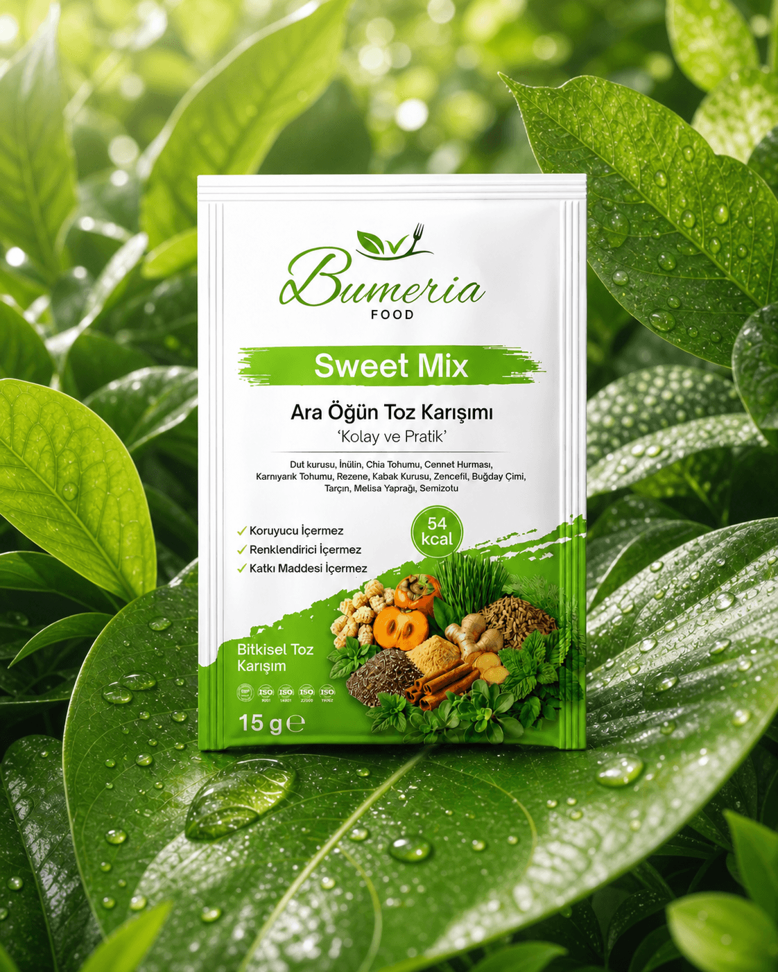


We started telling the story of the product from the table it came from, not the shelf.
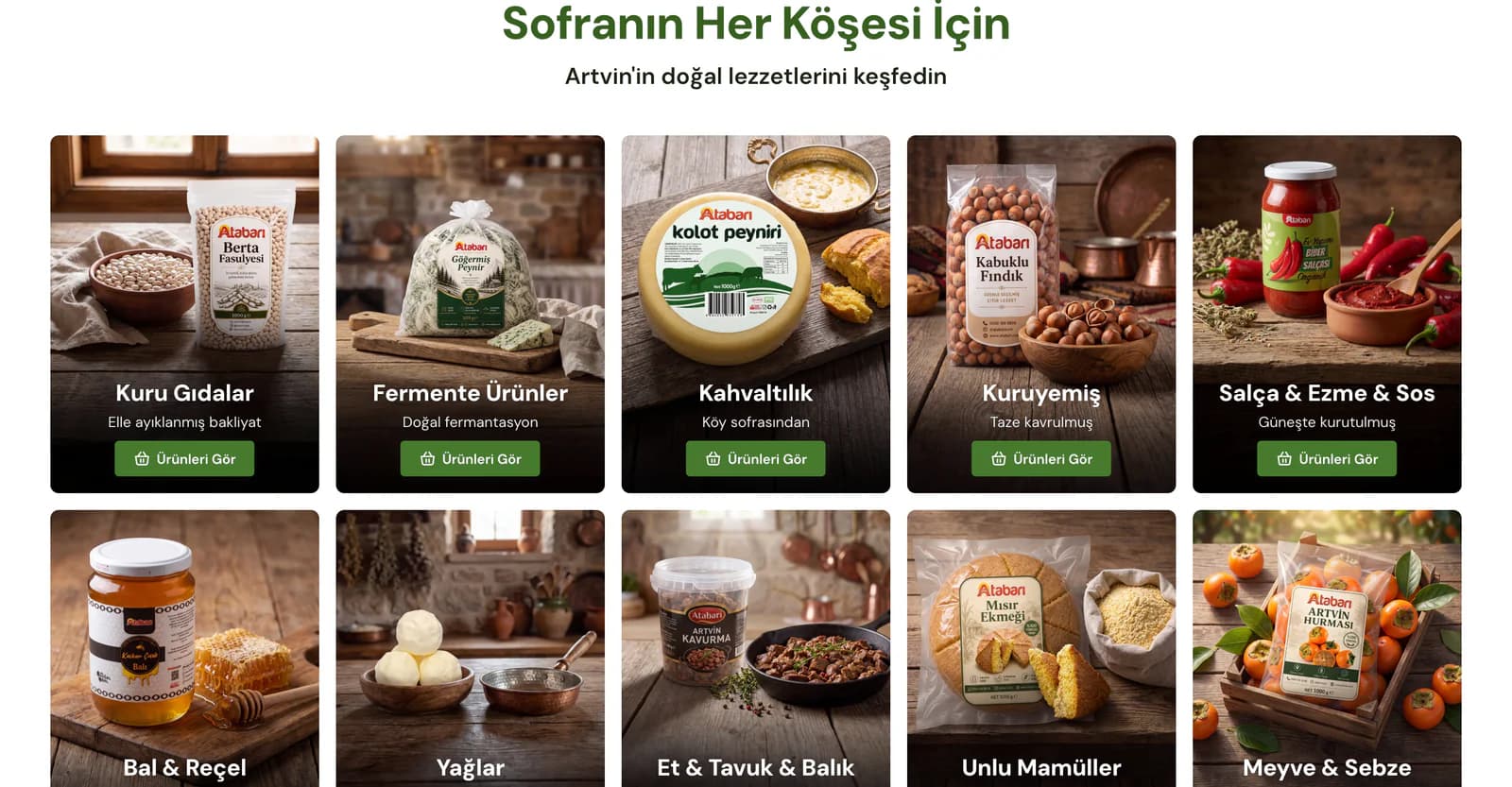
Across Atabarı’s catalog, from honey and cheese to butter and dry goods, we chose not to present products in isolation. Instead, we placed them within the geography they belong to. We brought the Kaçkar highlands, village tables, and Artvin landscapes into the first sections of the homepage, and created different scenes for honey, breakfast products, and dry goods. We used product packaging without letting it overshadow the story or become disconnected from it.
We built the visual language around the same idea. We used wooden surfaces, natural textures, warm light tones, and directional elements that evoke the green landscapes of the Black Sea region. We paired large photographs with simple headings and used spacing deliberately so product groups would remain distinct from one another. When customers enter Atabarı, they encounter a consistent brand world connected to Artvin rather than a generic food catalog.
We structured the homepage as a route for choosing by table and occasion, not as a product list.
We first highlighted the most preferred products, then divided the journey according to what the customer was looking for. Someone searching for breakfast products can move directly into the relevant group, while someone looking for a gift can reach ready made packages without taking unnecessary steps. Instead of trying to display the entire catalog on one screen, we divided the selection into showcases dedicated to specific product groups.
Further down the page, we placed real customer reviews, Atabarı’s Artvin story, and frequently asked questions that commonly arise before purchase. We did not treat product discovery, brand story, and trust content as three separate subjects. We arranged them within the same journey according to the order in which they matter to a customer making a purchase decision.
We carried the same approach into the use of imagery. Photographs of mountain houses, highlands, and dining tables explain where the brand comes from, while product imagery remains at the center of the shopping decision. A visitor can first choose the table setting or product group that interests them, then move on to the trust information they need before buying.
Customers should not have to discover the delivery method only after choosing a cheese.
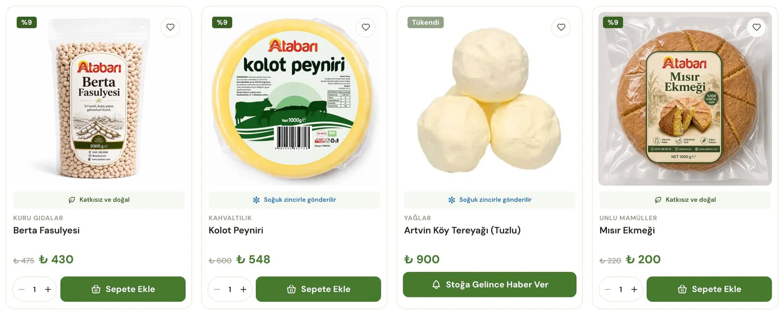
For a regional food store like Atabarı, how a product is shipped can matter as much as what the product is. For that reason, we did not limit category cards to a product image, name, and price. We marked products that require cold chain delivery and brought information such as additive free and natural product attributes, shipping time, stock status, and discounts to the card level.
For example, a customer comparing cheeses in the breakfast category does not need to open every product page separately to learn which items are shipped through a cold chain. They can compare the main differences directly in the listing and add their chosen product to the cart from there.
This decision reduced the effort required to choose within larger product groups. We placed the information most relevant to the purchase decision as close as possible to the point where that decision is made, while leaving more detailed information for the product page.
On the product page, we moved from “What is this?” all the way to the table.
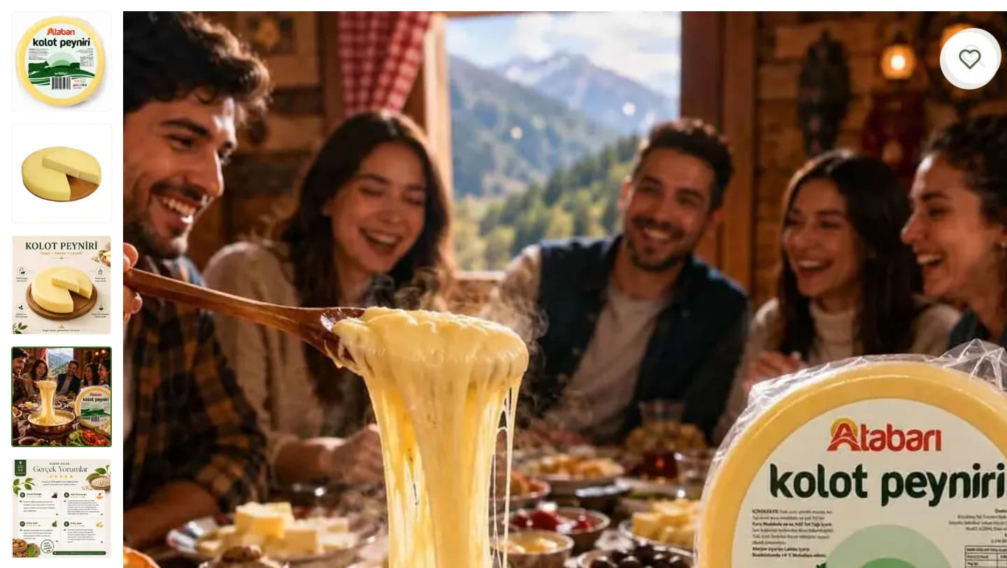
Because packaging alone is not enough to explain regional products, we prepared the visual area around different ways the product can be used. Alongside the package photograph, we included images showing the product itself, its key characteristics, and how it appears on the table. With products such as Kolot Cheese, customers can first examine the product and then see how it can be used in dishes such as kuymak.
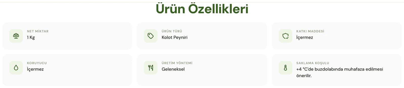
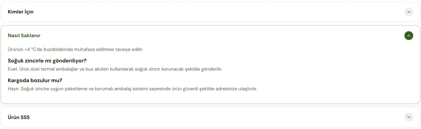
After the purchase area, we divided the information into sections rather than presenting it as one long block of text. We organized product features, descriptions, usage ideas, who the product is suited for, storage conditions, and frequently asked questions into separate areas. For products requiring a cold chain, we also kept packaging information close to the purchase decision.
We followed the same structure while transferring product information from the existing store into the new setup. We moved product descriptions in bulk and matched them with the correct products, then divided existing content such as production information, storage conditions, and usage suggestions into more readable sections without losing it. Customers can learn not only what a product is, but also how to consume it, how to store it, and how it will be delivered to them, all on the same page.
Instead of making customers search for the promotion in the cart, we showed them the result.
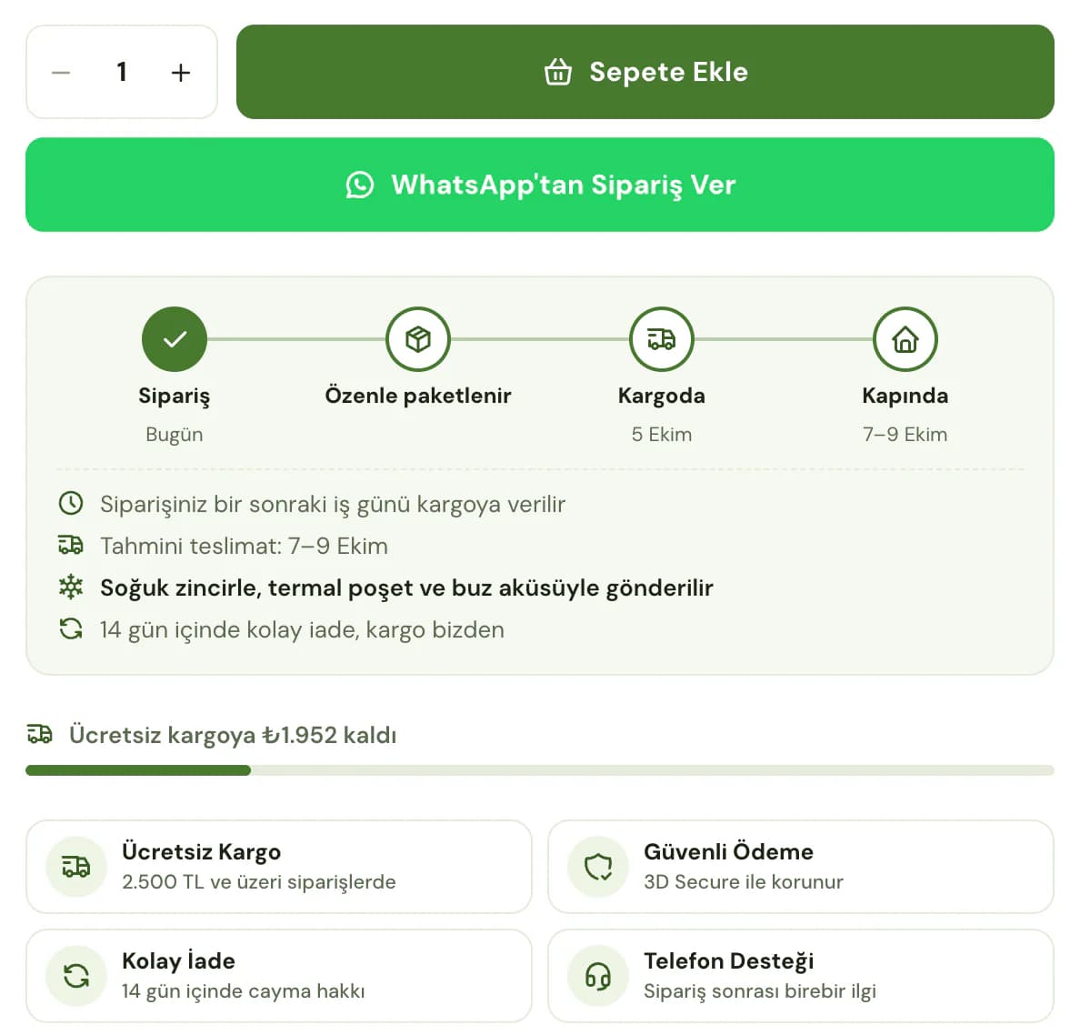
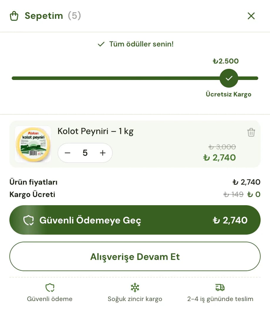
We did not want the free shipping threshold to appear only as a condition at the end of the shopping journey. We added a progress area to the cart showing how far the customer was from reaching the threshold. Once the condition was met, we opened gift selection within the same flow and kept the order total and shipping status visible together.
This allows customers to understand the current state of their cart without returning to a campaign page. Before moving to checkout, they can see how much remains until free shipping, whether they have met the condition, and whether a gift is available to choose.
We treated trust information in the same way rather than hiding it in a separate corner of the store. We distributed key points such as free shipping, secure payment, easy returns, and phone support across the areas where customers make decisions. We used Google reviews on the homepage and later in the product experience, and supported topics such as delivery and cold chain shipping with frequently asked questions.
On mobile, we set priorities instead of reducing the content.
We kept the important parts of Atabarı’s product information available on mobile rather than reserving them for desktop. We prepared showcase and product images for different screen sizes and prioritized the content customers need first when the page loads. We arranged category browsing, product viewing, and the path to the cart so each step would be easier to follow on a smaller screen.
We worked separately on the mobile loading order so customers could begin shopping without unnecessary waiting in a store with image heavy products and detailed descriptions, and set up images to load at the right size on different screens.
We left the final storefront decisions to the brand itself.
Because the products and campaigns Atabarı wants to highlight will change over time, we prepared showcases, campaign areas, category ordering, colors, and text so they could be edited through ikas. We avoided creating a dependency on development for everyday content changes.
We built the structure to bring together the story of products from Artvin, the information needed to make a choice, and the conditions of the shopping experience within the same flow. The Atabarı team can decide for itself which table, product, or campaign to highlight at any given time.