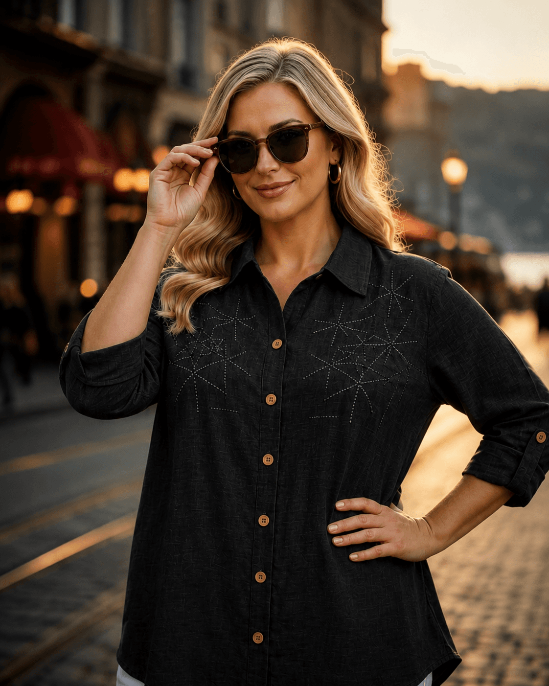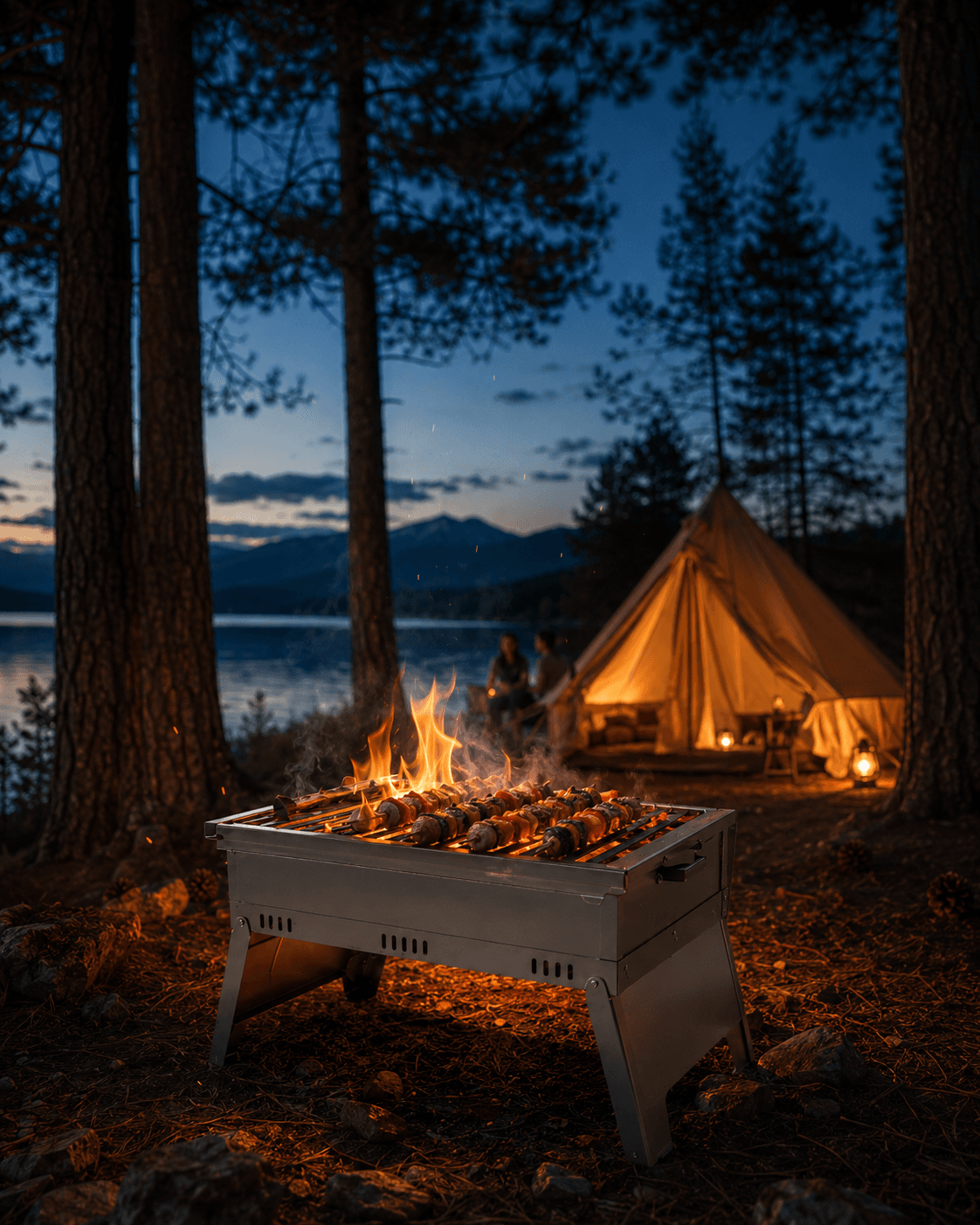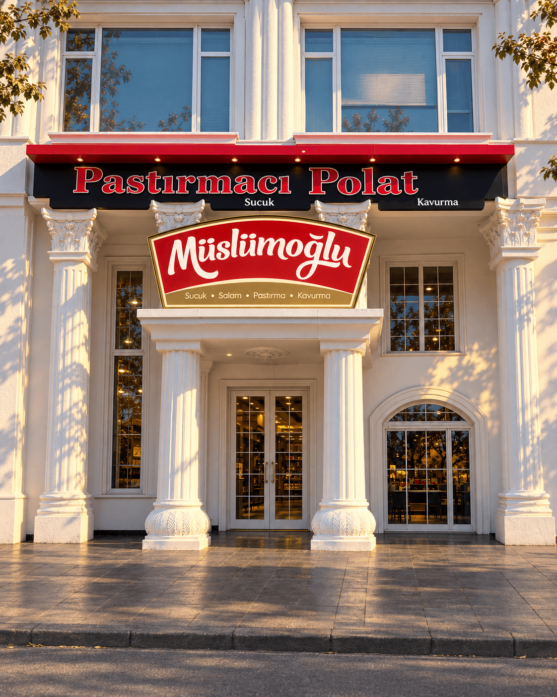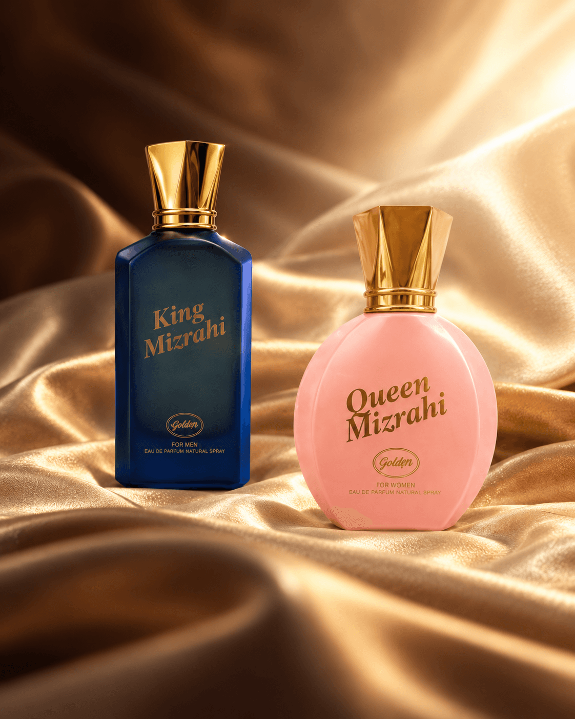

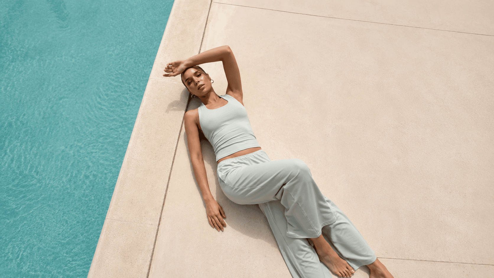
Le Pole presents women’s activewear through a store experience built around strong brand photography.
Le Pole offers leggings, tracksuits, sweatshirts, and homewear across hundreds of products in dozens of collections. Because the brand’s visual language is built around vertical photography, the theme is designed to preserve that framing throughout the store. The experience helps customers understand not only how a product looks, but also its movement, fit, and how it can be styled with other pieces.
The design language centers on vertical photography, generous spacing, and product-led storytelling.
The store’s visual language reflects the energetic and image-led character of activewear. Vertical brand photography stays uncropped across product cards, homepage showcases, and story areas; headings remain short and directional, while generous spacing gives each image room to stand out. The homepage supports discovery, product pages support decision-making, and the cart helps customers complete their purchase quickly.
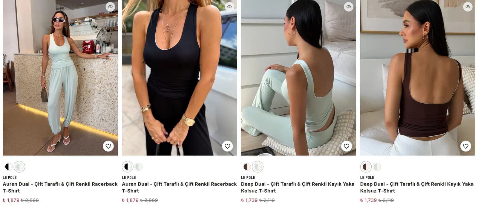
Vertical product cards preserve the brand’s photography style across the entire store.
Le Pole prepares all of its brand photography in a vertical format, and the theme uses that visual standard directly. Product cards, showcases, and story areas keep the same ratio so the full product remains visible. This allows the visual language established on social media to continue inside the store and lets new shoots be used without additional recropping.
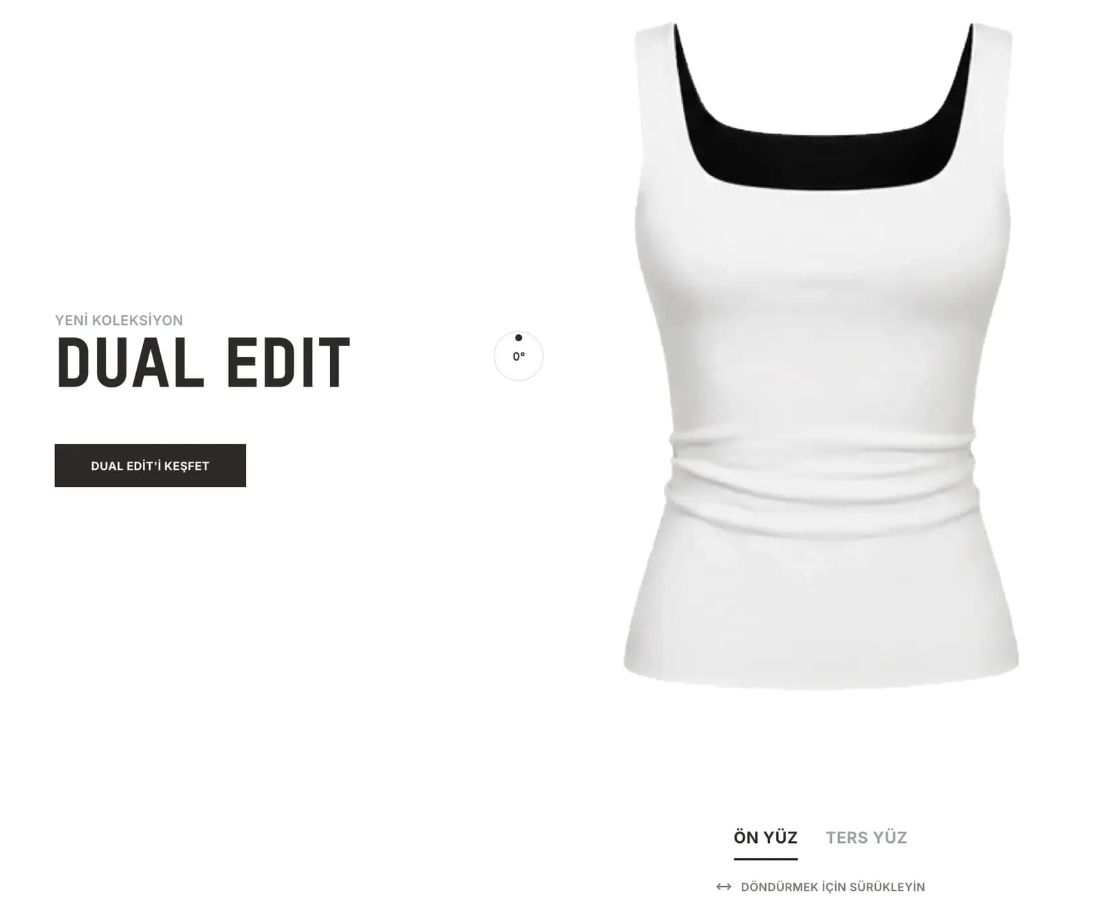
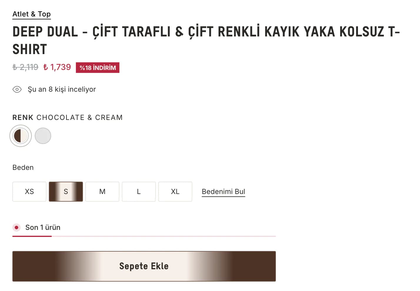
The product page introduces each item through rotation, detail, and styling suggestions.
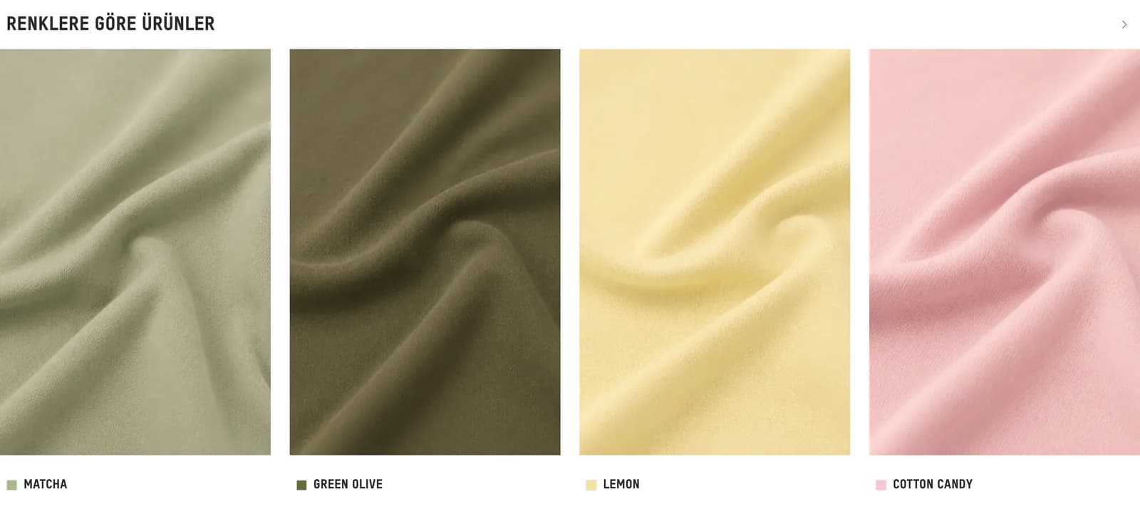
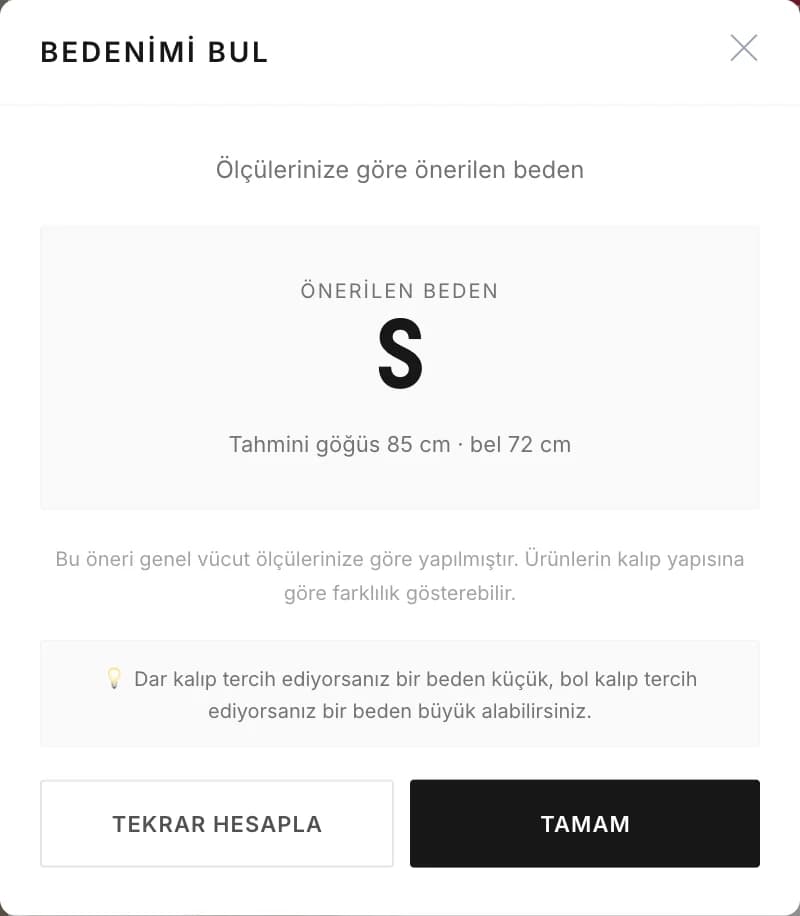
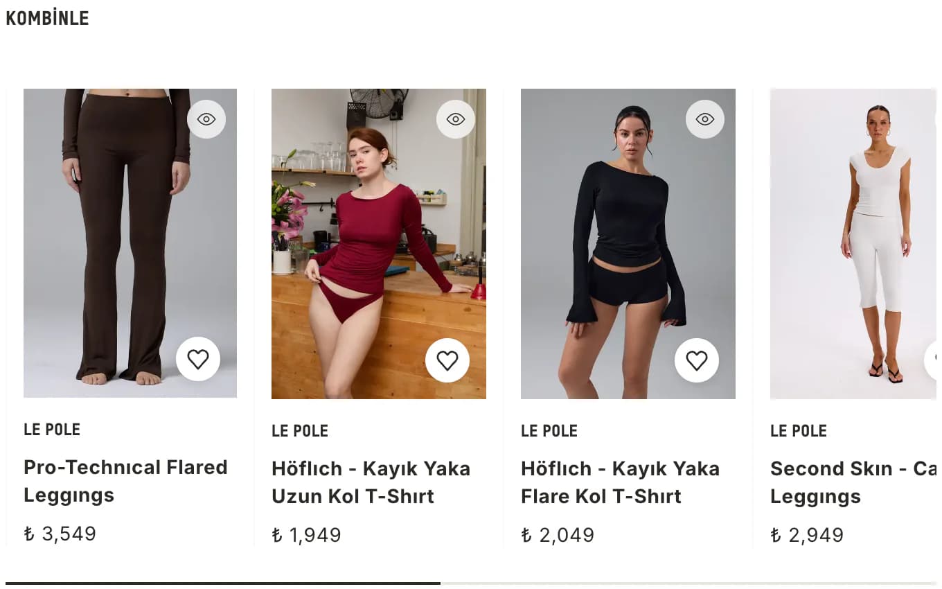
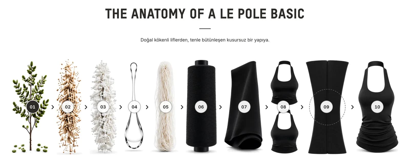
In activewear, fabric drape, fit, and different viewing angles can influence the purchase decision. The product page combines a rotation view, quick view, color-based selection, outfit suggestions, and product detail sections. Customers can examine the item from different angles, see which pieces work together, and understand the product construction more clearly.
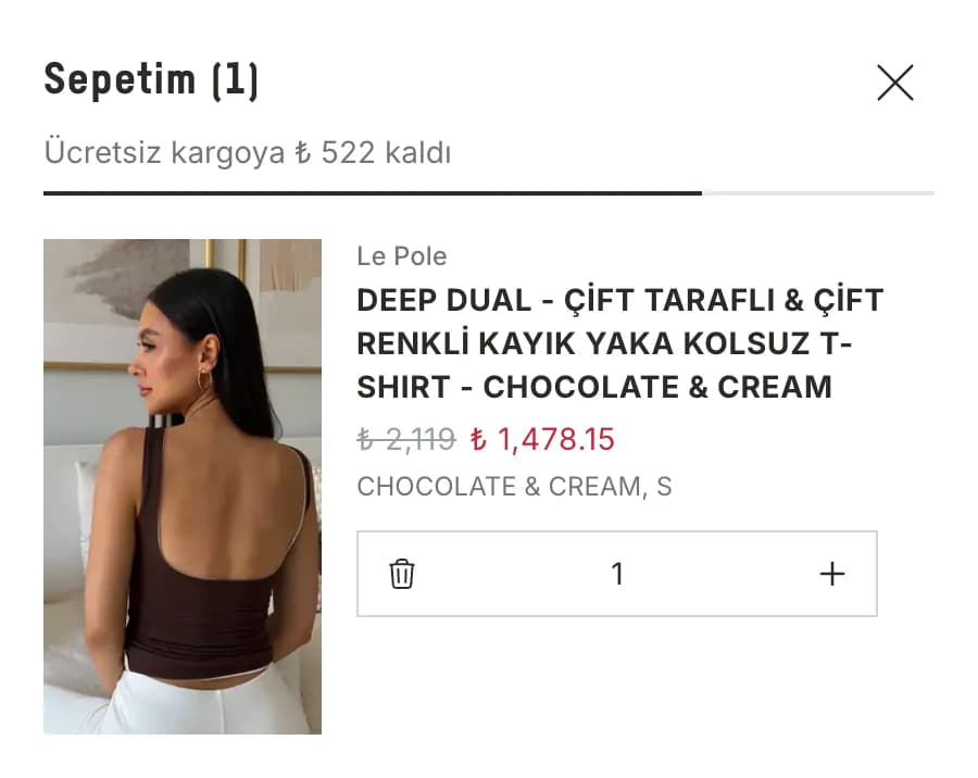
The cart and collection menu make the next step clear for customers.
The shipping progress area in the cart shows customers how much more they need to spend to reach the next free-shipping threshold. The store team can adjust those thresholds according to the current campaign. The visual mega menu also presents all collections in one place, helping customers reach the product group they want more quickly.
Video and page loading are arranged to keep mobile shopping smooth.
The homepage opens with video, while the story area presents products in a format that feels natural to browse on a phone. Video areas are prepared with real mobile use in mind, and pages are arranged to load only the content that is needed. This keeps the visual and video-rich experience light even across a broad catalog.
The store team manages shipping campaigns and everyday content from the ikas editor.
Free-shipping thresholds, collection presentation, and other frequently updated areas can be managed directly from the ikas editor. When a campaign changes, you do not need to touch theme code to update the shipping thresholds or change showcase content. The store therefore fits naturally into the brand team’s everyday workflow.
Le Pole now runs as a store that preserves its brand photography and enriches product presentation.
The theme maintains the same vertical visual system from product photography to story areas and brings rotation views, styling suggestions, and product details together on product pages. The release checklist created during the project is also used to keep the core store experience consistent across new versions. Quick summary: vertical brand photography stays intact · products can be explored from different angles · outfit suggestions support product decisions · shipping thresholds are managed from the editor · mobile shopping stays smooth.