




We made explaining a product you cannot smell through a screen the central idea.
Goldmi offers both perfume and IPL devices for at-home use in the same store. For that reason, instead of only displaying products, we placed the information customers need to make a decision on screen directly into the product story. Because fragrance cannot be experienced directly online, we turned note structure, scent character, usage moments and collection story into decision-supporting content alongside the product photography.
We combined dark, almost black backgrounds with gold tones and used cream-colored page areas with elegant serif headings. Letter-spaced uppercase labels above headings and thin gold lines underneath create a shared visual language between fragrance and personal care products.
We separated two different product worlds within the same brand identity.
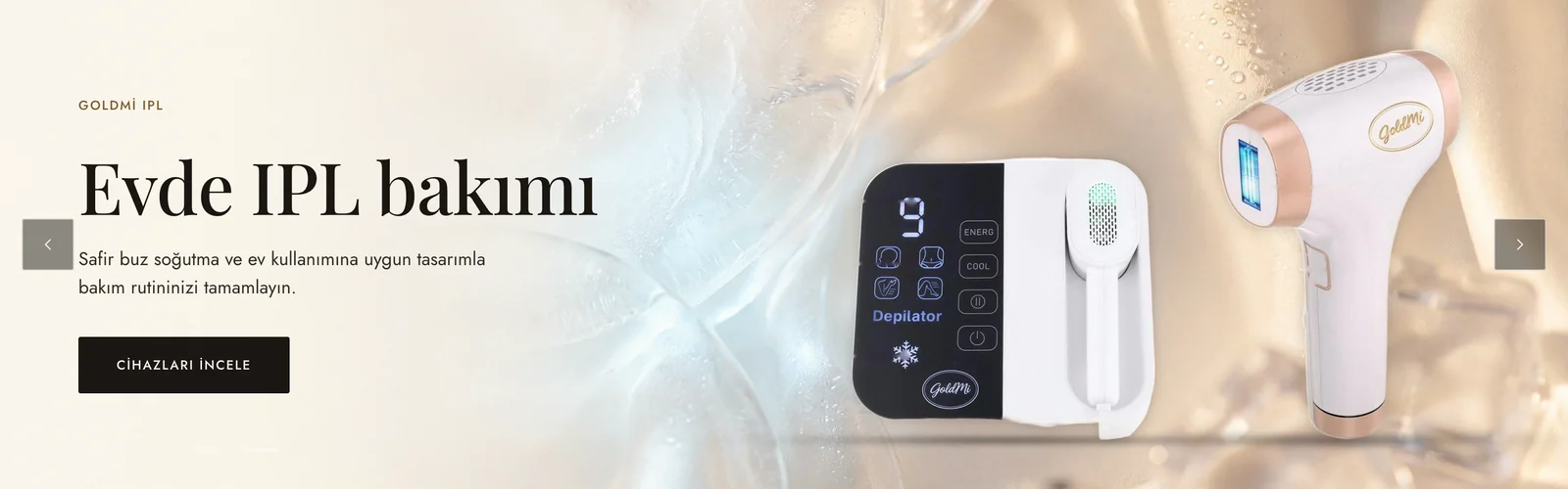
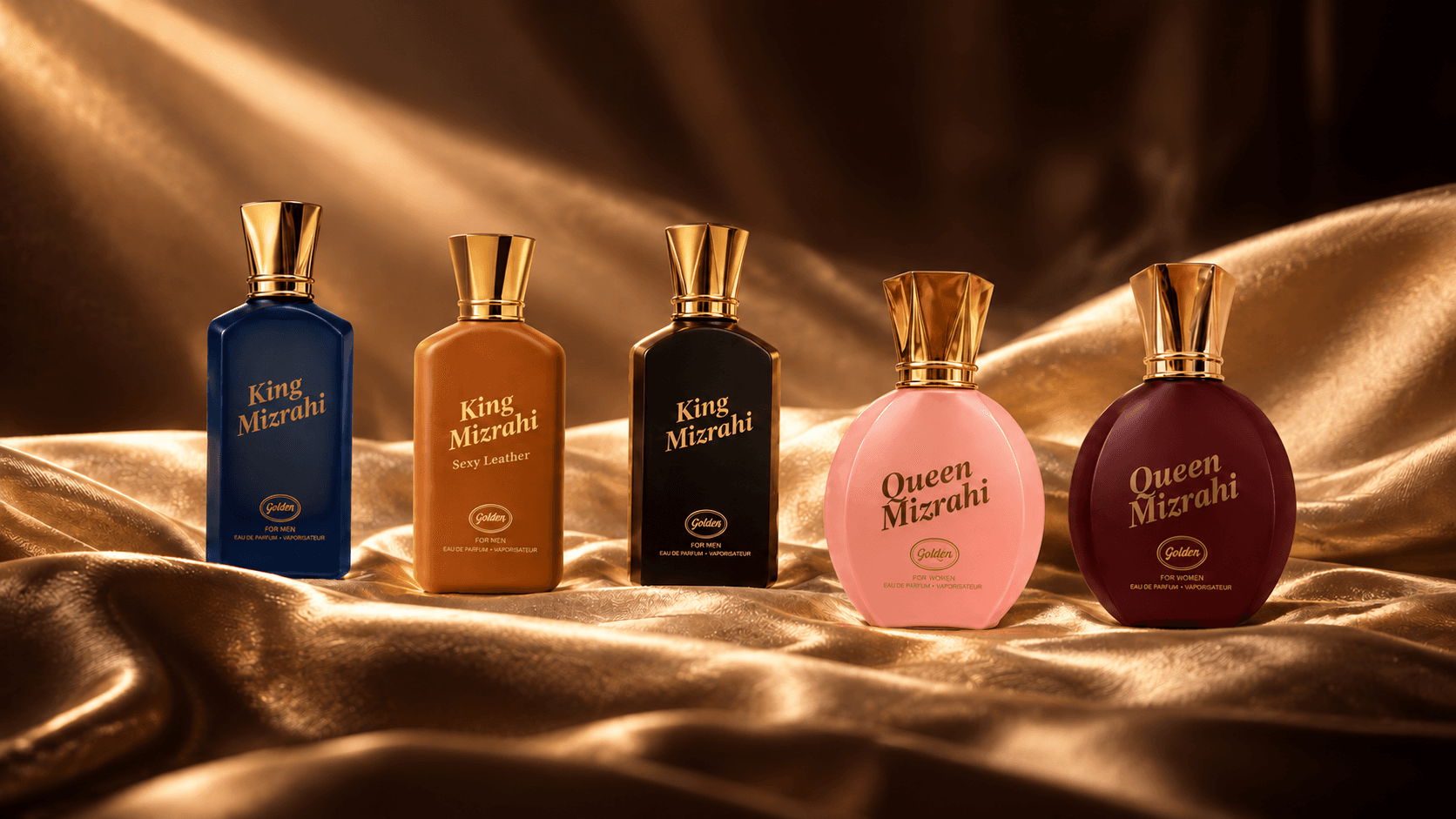
Perfume and IPL devices cannot be explained in the same way. For this reason, we used separate opening slides on the homepage for King Mizrahi, Queen Mizrahi and IPL. Each section introduces its own product world while typography, color usage and page rhythm remain consistent. This makes the category change clear to the customer without breaking the store’s overall identity.
In the desktop menu, we grouped Kadın parfüm, Erkek parfüm, Epilasyon cihazları and İletişim on the left and placed the logo in the center. In the top announcement bar, we rotate shopping information such as free shipping, fragrance campaigns and shipping time.
We moved fragrance selection beyond the product name and into the scent profile.
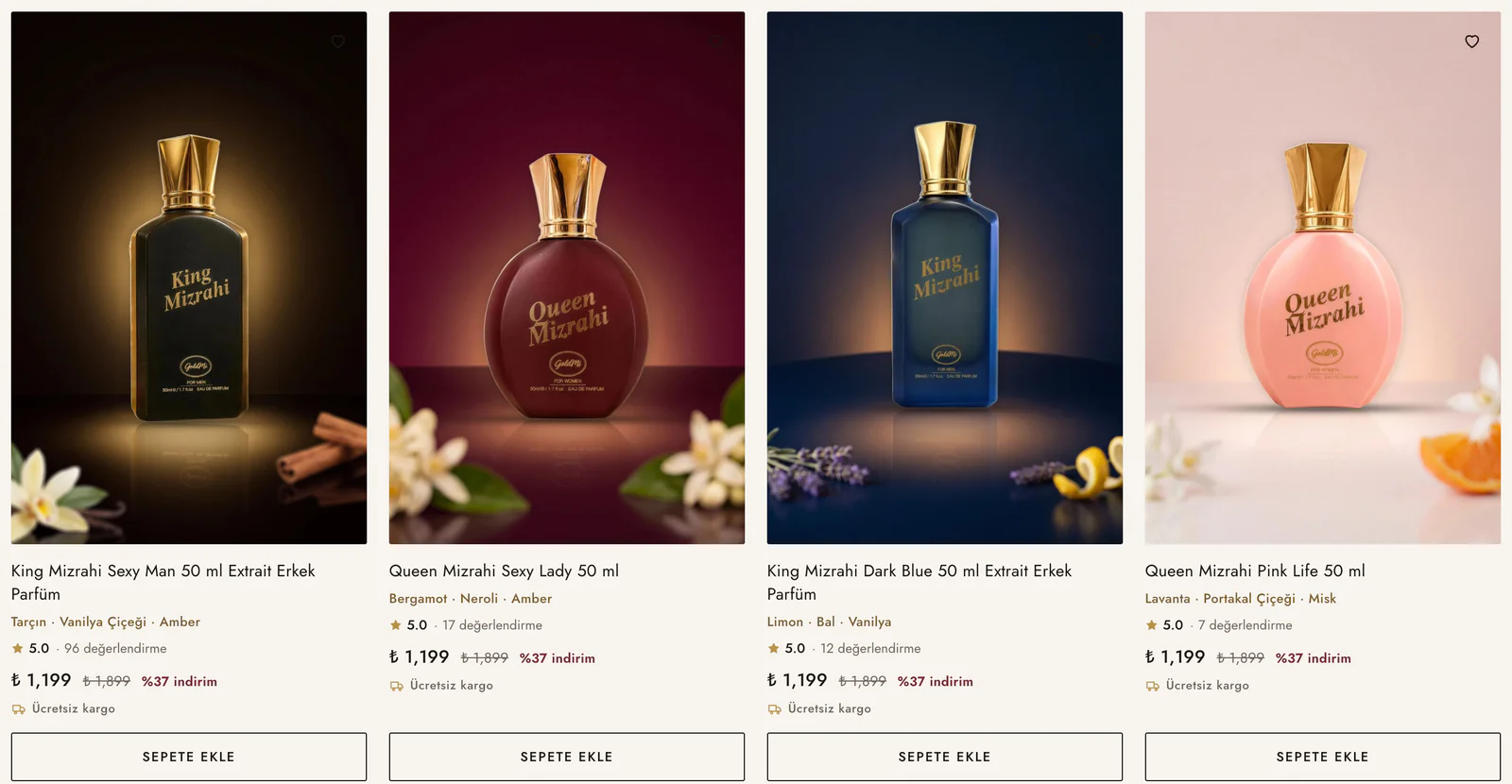
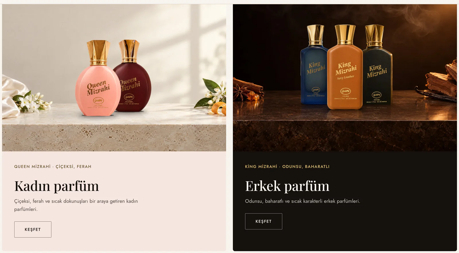
In the “Çok satanlar” section on the homepage, we show three key scent notes below each fragrance name. In “Kokunu bul”, we present Queen Mizrahi and King Mizrahi as two distinct fragrance worlds. By separating floral and fresh profiles from woody and spicy ones, we help customers find a collection closer to their own preference instead of choosing by product name alone.
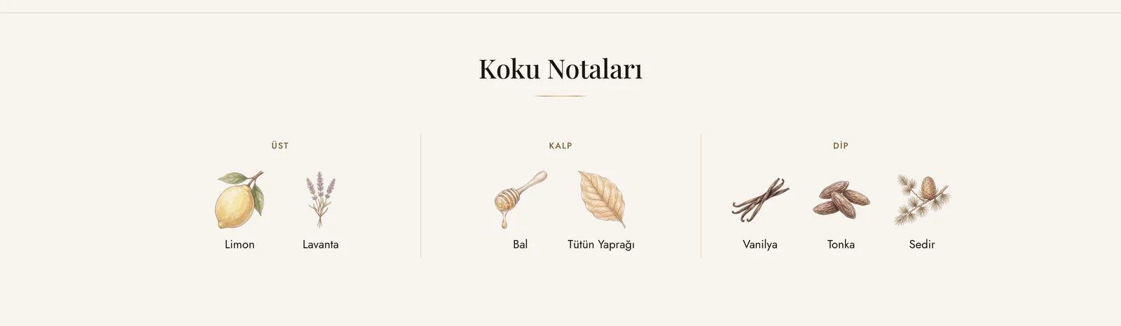
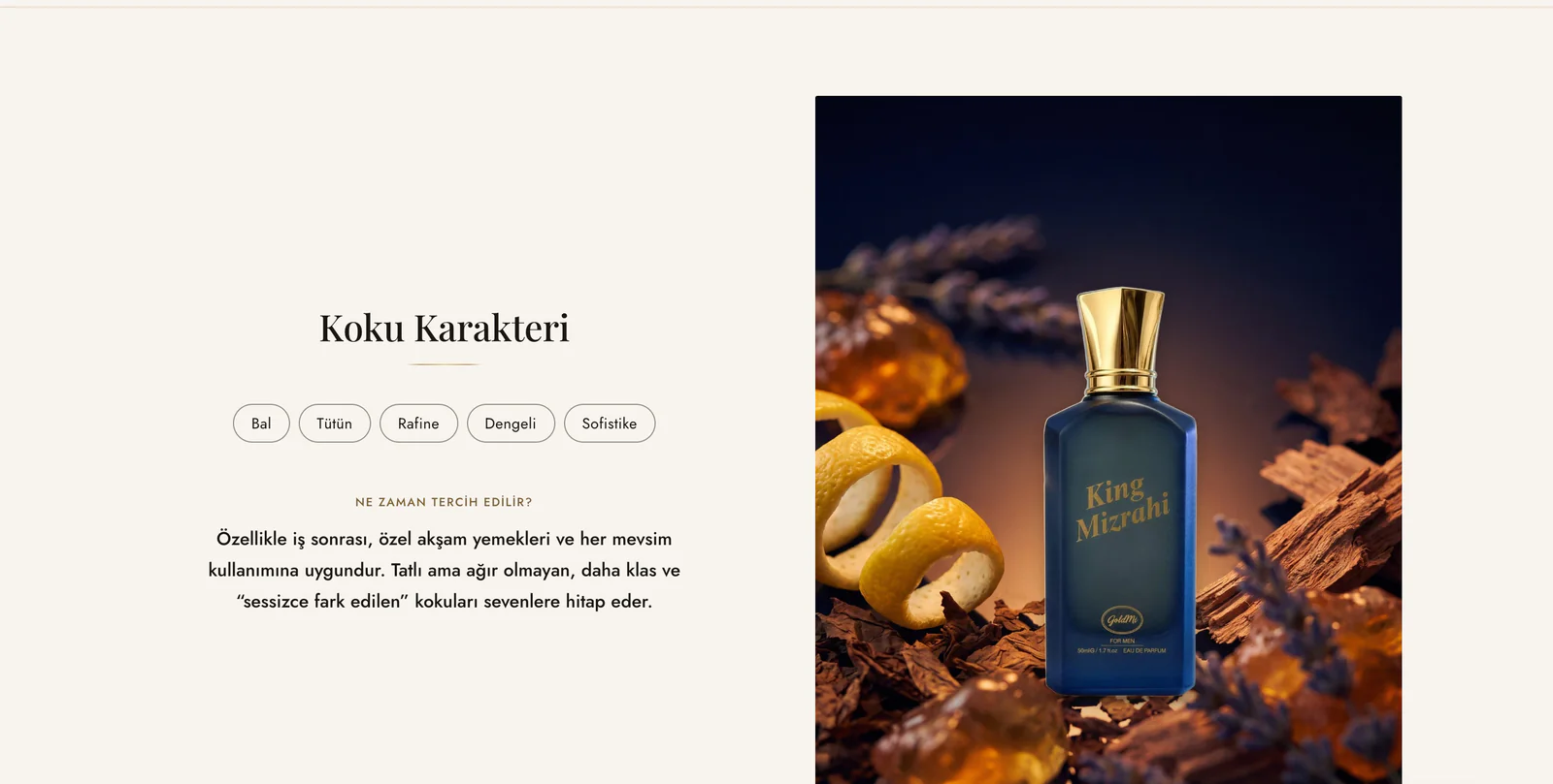
On the product page, we take this explanation further. We show top, heart and base notes in a fragrance pyramid and use character tags such as woody, vanilla-like or warm. In the “Ne zaman tercih edilir?” section, we explain usage moments and seasonality, then present scent profile, essence intensity, bottle volume and book-box presentation in separate cards.
We turned package selection from campaign copy into part of product selection.
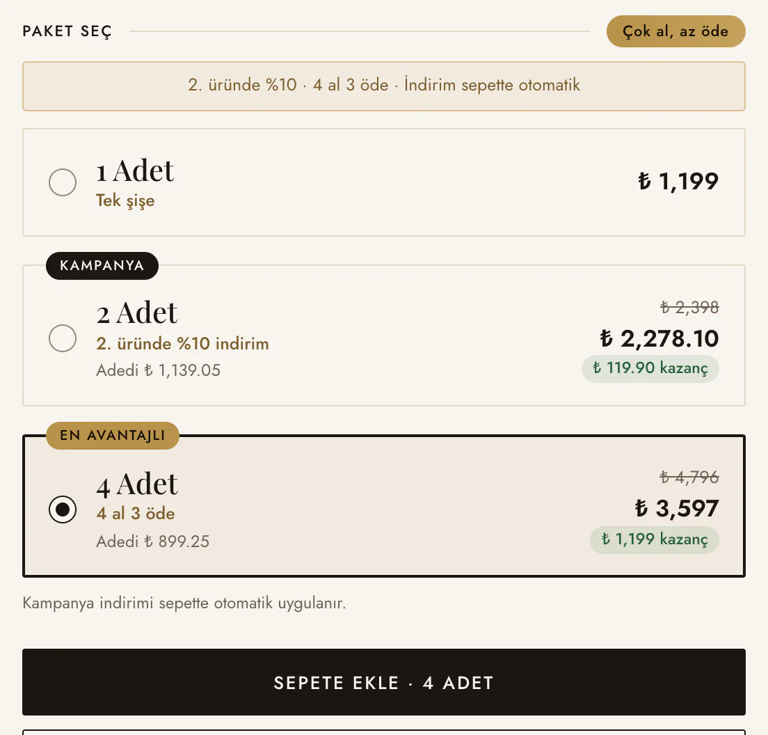
On fragrance product pages, we designed the “Paket seç” area as cards where quantity options can be compared. Customers can see the single, two-product and four-product options in the same area. Each card shows the price per item and the benefit offered, while the highlighted option is marked with a badge. When a choice is made, the add-to-cart button also reflects the selected quantity.
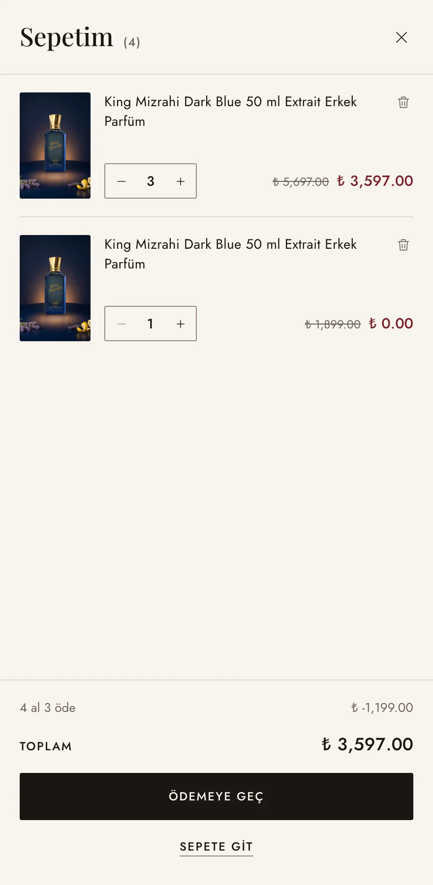
We made the campaign discount apply automatically in the cart and appear as a separate line in the cart drawer. This way, the calculation behind the choice made on the product page remains visible when the customer moves to the cart.
We used the same structure for perfume and IPL products, but with different content.
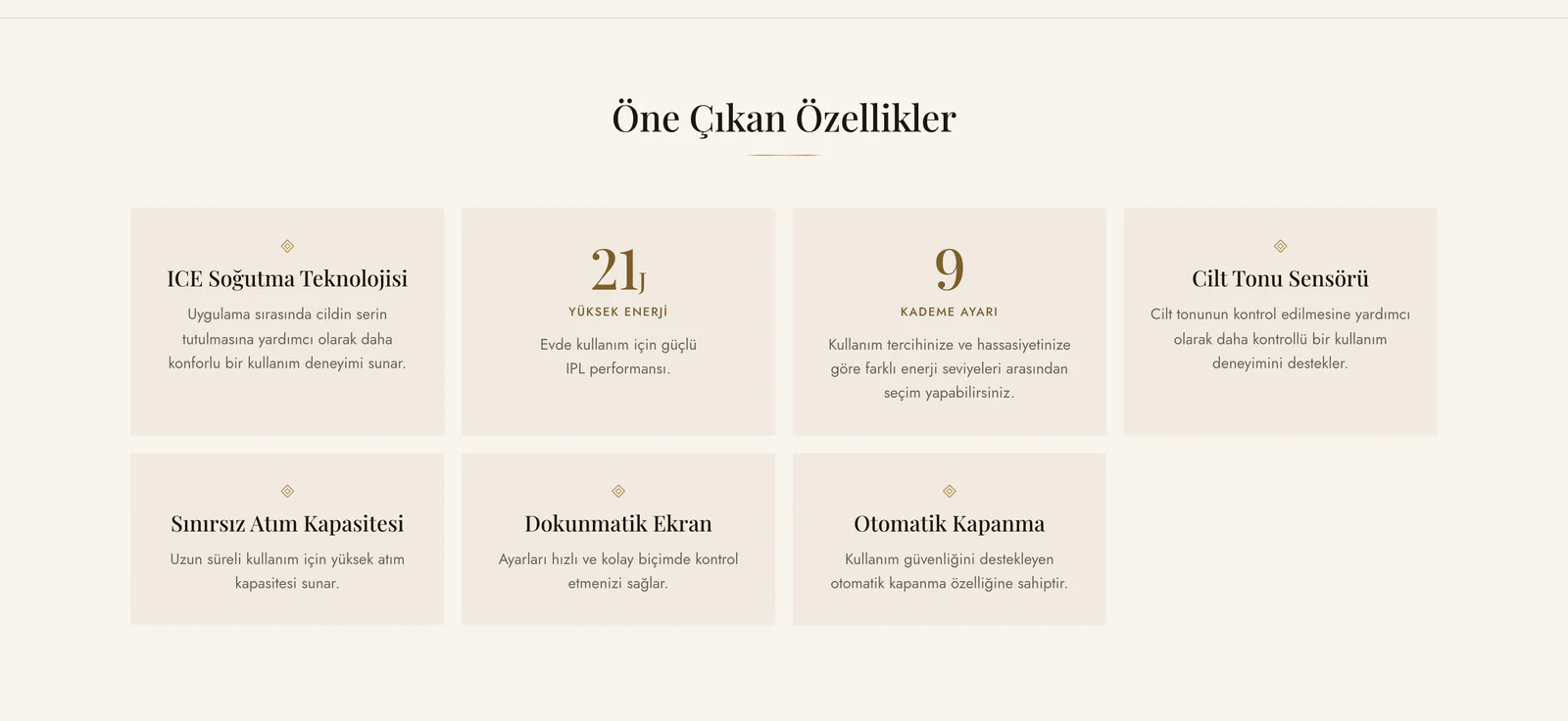
We created a shared product-page language across the store without forcing different product types into the same story. On fragrance pages, the scent story, notes, character, usage time and collection are the focus. On IPL device pages, we present features such as ice cooling, energy level, level adjustment, skin tone sensor, touch screen and automatic shut-off in separate cards.
On IPL product pages, we also created dedicated areas for usage, color selection and official distributor warranty. This allows customers to encounter a visually familiar structure while the information they need for the purchase decision changes according to the product category.
We made product storytelling manageable on a product-by-product basis from the panel.
To avoid limiting every product to the same description, we divided content into separate fields. Benefit lines, storytelling visuals, storage conditions, delivery and return information can be entered individually for each product from the panel. The theme then displays each piece of content in its designated place on the product page.
For fragrances, the short slogan and scent notes remain close to the purchase area, while the more detailed story continues further down the page. This structure keeps essential purchase information from getting lost inside longer content while still allowing customers who want more detail to explore the product further.
We treated reviews as a source of product information, not only as a rating.
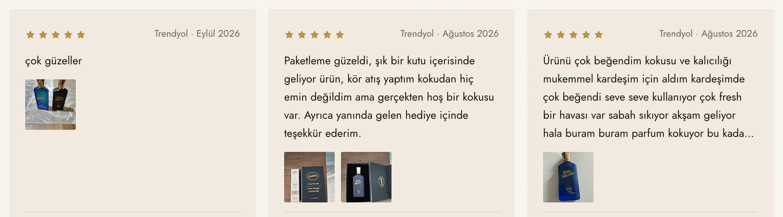
In the product review area, we show the star distribution, topics customers highlight such as scent, longevity, packaging and gifting, and reviews with photos. We also display the brand’s Trendyol reviews in the same area while clearly stating their source. This allows customer experiences from different channels to appear within one product story without hiding where they came from.
At the end of the product page, the “Bunları da beğenebilirsiniz” section provides a route to other products. The customer reviews section on the homepage also supports the product story without leaving it entirely to brand-written content.
We used the brand story to connect the different product categories.
On the Hakkımızda page, we brought together the fragrance collections’ inspiration from Eminönü’s essence culture, the King and Queen Mizrahi worlds and the at-home care technology side within one brand story. In the “GoldMi imzası” section on the homepage, we present fragrance-related brand information with large figures, while the IPL section uses a separate band for the devices’ highlighted information.
The store we built for Goldmi explains fragrance through content while bringing very different product categories together within the same visual identity and shopping structure.