

At Tarzım Süper, the main challenge was not showing products, but making choices easier.
Shopping across Tarzım Süper’s womenswear collection involved more than choosing a single product. Customers needed to find the right style among dresses, tops, sets, pajamas, and other product groups, then decide on color and size. We therefore built the custom ikas theme so customers could narrow down their options at each step.
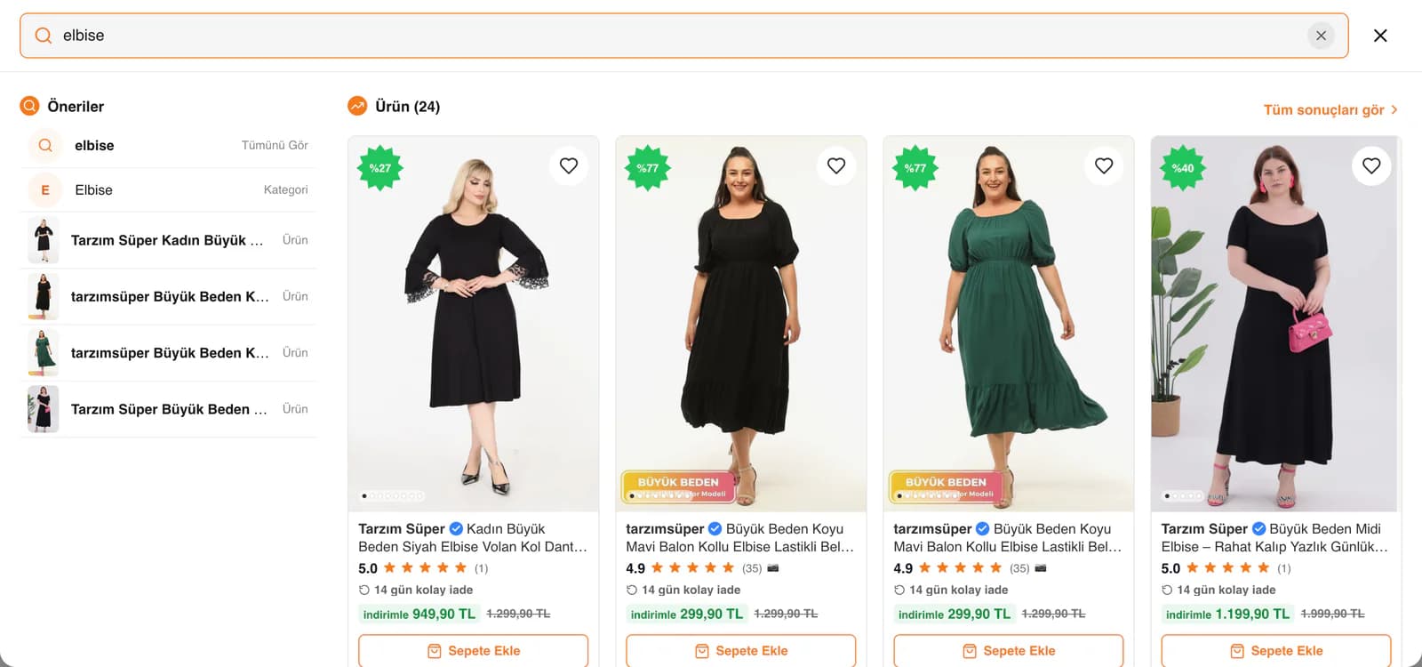
We treated search as part of the same logic. Alongside products, we included category and size search, and brought popular searches and product suggestions into the same area. From one point, we created two different paths: customers who knew what they wanted could move directly toward a product, while those who were still deciding could discover new options.
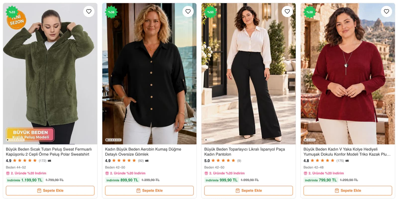
On the design side, we gave product photography and video plenty of space. Text, campaign messages, and supporting information were positioned so they would not overpower the products. Spacious layouts, short messages, and clear headings balanced the visual density created by the broad collection. Customers see the product first, followed by the price, campaign, color, and size options.
We placed campaigns inside the shopping experience instead of building a separate world around them.
Discounts and offers were an important part of the shopping decision at Tarzım Süper. For that reason, we did not limit campaign communication to large banner areas. On product cards, we brought the current price, discount information, reviews, and add-to-cart action together within the same flow.
We created a separate showcase for offer products while keeping categories in a different discovery area. Messages about secure shopping, payment, shipping, and returns on the homepage were also placed within the shopping flow rather than in separate sections that would pull customers away from products. On mobile, access to the menu, main sections, and cart continued from the bottom of the screen.
This separation allowed customers looking for campaigns to review price advantages quickly, while customers heading toward a specific product group could move to their category without getting lost among promotional areas.
We brought size, color, and stock information together at a single decision point.
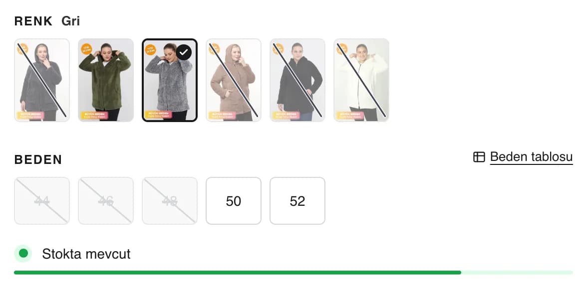
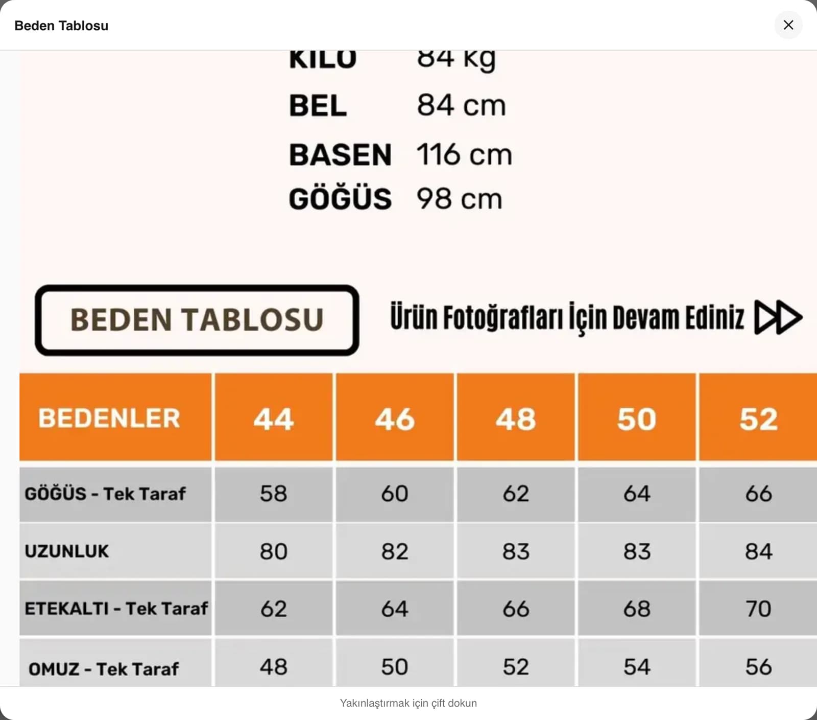
Because finding the right variation matters as much as finding the right style in plus-size womenswear shopping, we built the product page selection area around that need. We presented color alternatives visually, placed sizes directly after them, and kept the size guide close to the point where customers made their selection.
When the color changed, we updated the available sizes accordingly. Instead of hiding sold-out options completely, we kept them visible but unavailable for purchase. This allowed customers to understand which alternatives the product was offered in and decide on another color or size without leaving the page.
We brought product images, video when available, color alternatives, sizes, stock information, Buy Now, and Add to Cart into the same purchase flow. Rather than creating disconnected steps, we built a single selection area centered around the product.
We used video for what photography could not fully explain.
Some details in clothing are difficult to understand from a still image alone. The movement of the fabric, how the product sits on the body, or how the cut looks while walking are some examples. On products with video, we integrated this content into the product review experience instead of treating it as separate promotional material from the photography.
We also designed the video and story areas on the homepage to feel close to familiar content consumption patterns, especially on mobile. Videos were prepared to run more lightly before being added to the store, and we created a structure where new content could be added without requiring a long preparation process.
As a result, the Tarzım Süper team could present new collections through moving content, while customers could review not only studio images but also how products looked in motion.
We reduced the unanswered questions around the purchase button.
Choosing the product and size was not the entire purchase decision. We also wanted customers to learn when their order would be shipped and what previous buyers thought about the product at the same stage.
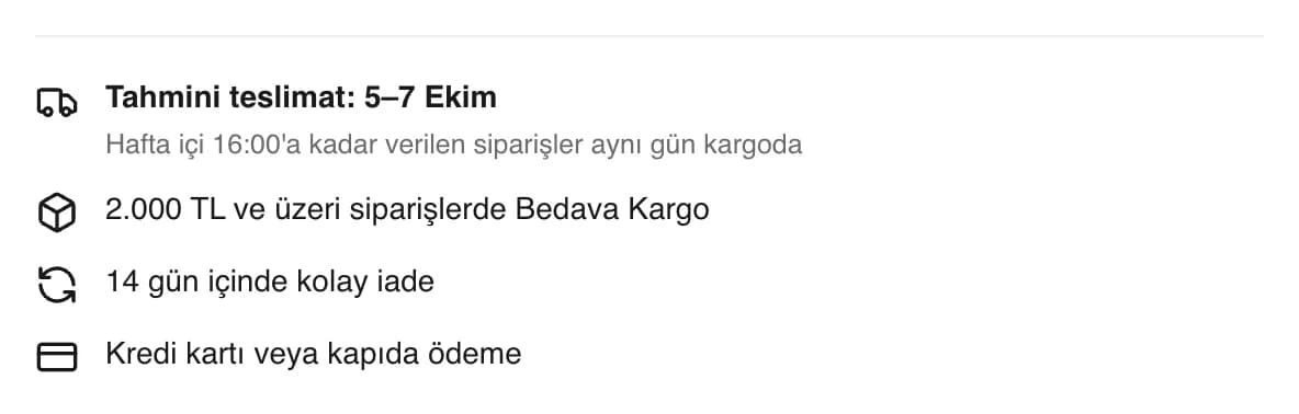
Instead of using shipping information as fixed text, we built a structure that took weekdays, Saturdays, Sundays, and public holidays into account. If an order could genuinely be prepared on the same day, we showed the remaining time; when that was not possible, we highlighted the estimated delivery date. Customers could see up-to-date shipping information for that specific day directly beside the purchase area.
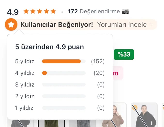
We also did not place reviews out of sight at the very end of the product page. We brought the rating, review distribution, photo review option, and search within reviews into the continuation of the product decision. In particular, customers who were unsure about sizing and fit could review the experiences of people who had already purchased the product without leaving the page.
We placed more than products on category pages.
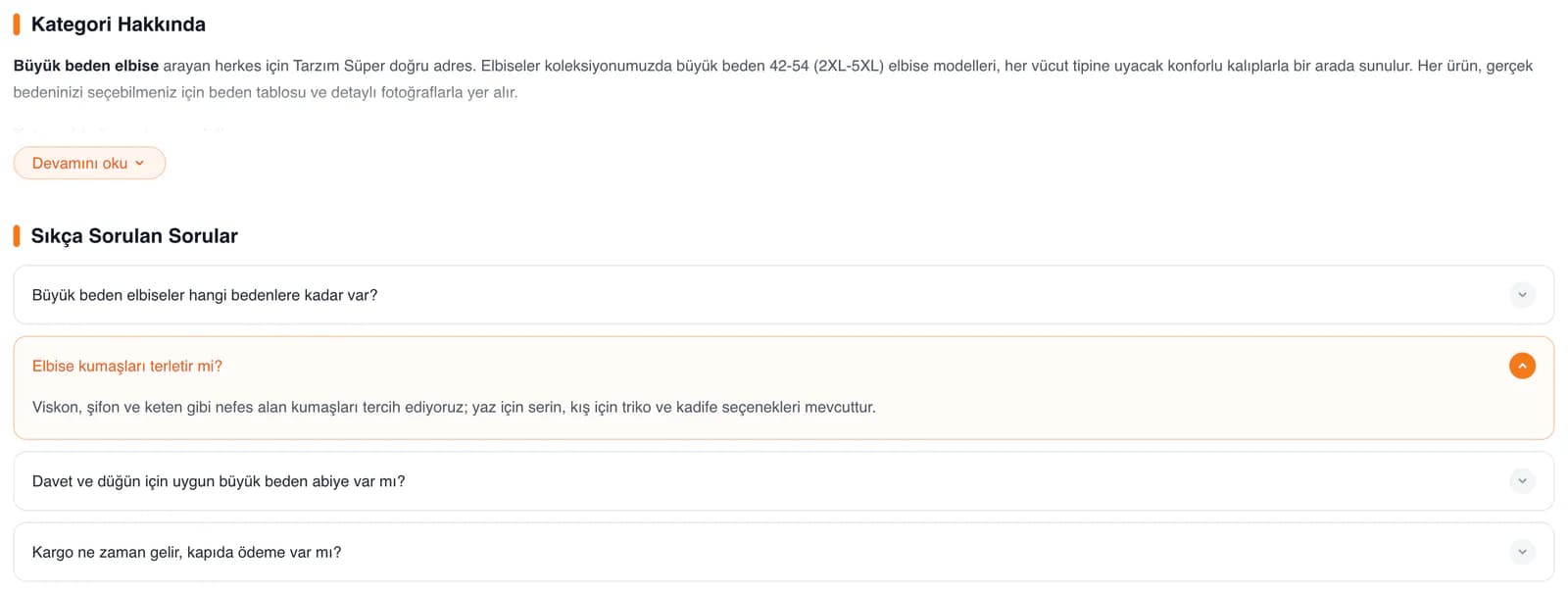
On dress and other category pages, the customer journey did not end with filtering and sorting. We addressed topics such as fabric, use cases, and size selection, which varied by product group, further down each category page.
We prepared separate descriptions and frequently asked questions for each category. This meant collection pages became more than long lists of products; customers could also access basic information that could help them make a choice while browsing the product group. By preparing this content specifically for each category, we also created a foundation for Tarzım Süper to describe its different product groups more clearly in search results.
We built the store so it would not need to be rebuilt every time campaigns changed.
For a store like Tarzım Süper, where collections, campaigns, and content can change frequently, we did not want every update to require a new development task. We connected campaign labels to badges that could be used on products and created areas where the store team could manage day-to-day changes to installment information, shipping areas, and video content.
After launch, we did more than simply hand over the project. We improved the video flow, expanded installment options, added campaign management, and prepared category content. We continued evolving the structure we had built from the ground up so it could keep pace with changes across Tarzım Süper’s products, campaigns, and content.