

We organized the catalog around the logic of preparing for a camping trip, not around the size of the store.
Kamp ve Ötesi had an extensive product range covering very different needs, from tents and sleeping equipment to camp kitchens, barbecues and fire gear, tables, chairs, and clothing. For that reason, we did not approach the project as a problem of fitting more products onto the homepage. The real challenge was helping customers with different intentions find their own way through the same catalog.
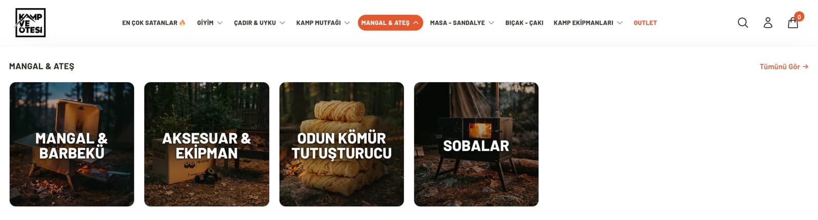
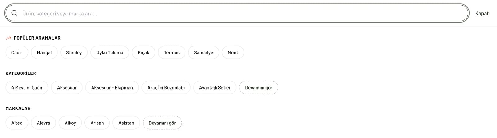
One customer may be researching which tent to buy, while another may be looking directly for a camping stove. Someone else may arrive without a specific product in mind and become interested in new season equipment, ready made sets, or an item they see in a camping scene. We built the main navigation and search around these different starting points. We clearly separated the core need groups and made it easy to move quickly between products, categories, and brands in search.
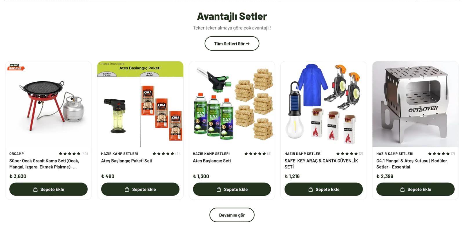
We also designed the homepage as a meeting point for different discovery paths rather than a single product list. We separated featured products, camping stoves and fire equipment, table and chair selections, ready made camping sets, and video content into their own contexts. A customer who knows what they need can move directly to the relevant group, while someone who has not yet decided can encounter different use ideas while browsing the store.
We did not reduce an outdoor product to a photograph on a white background.
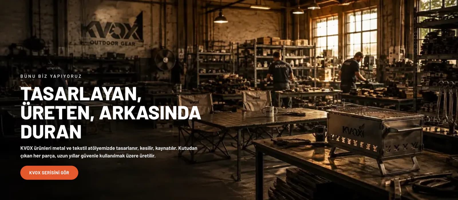
In outdoor shopping, where and how a product will be used can influence the decision as much as its dimensions or specifications. For this reason, we built the visual language of Kamp ve Ötesi between clear product photography and large camping scenes. When necessary, we showed the product on its own with clarity; when context mattered, we placed it within the outdoor environment where it would actually be used.
We arranged spacing, visual weight, and content order with the same approach. Because the store contained many different categories, we did not want every area to communicate with the same intensity. We used larger visual spaces for products or collections that needed emphasis, while keeping faster scanning sections simple and product focused.
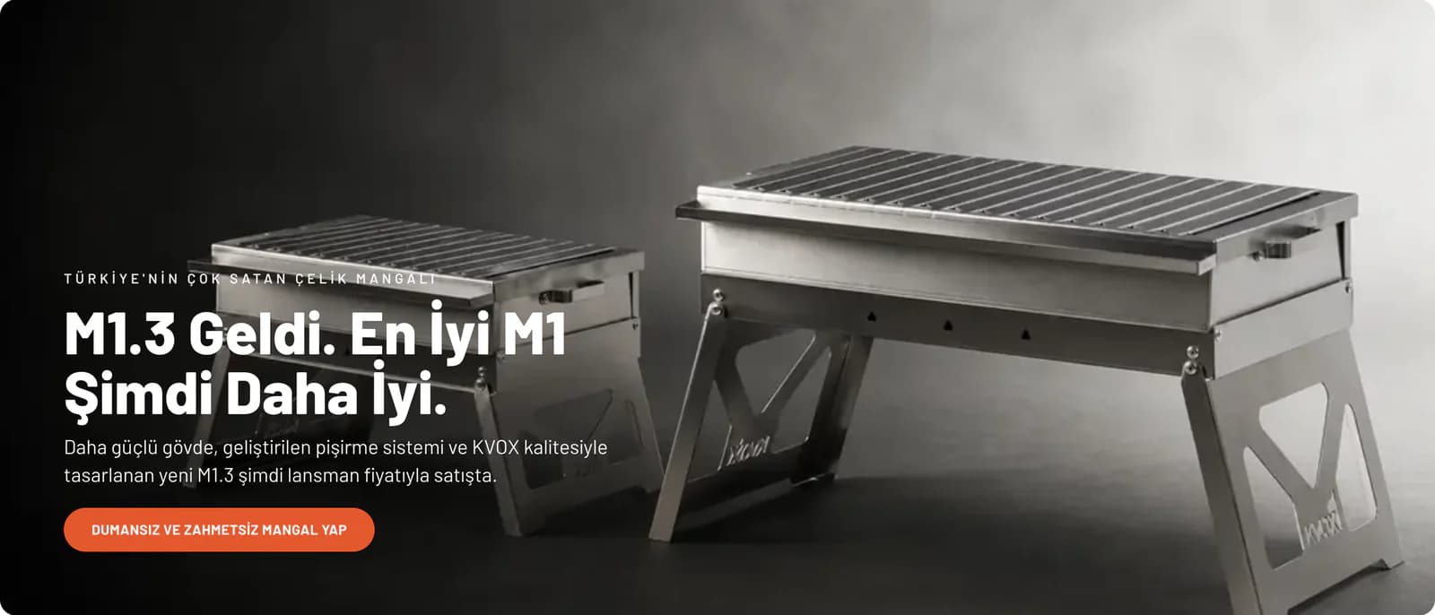
We gave products such as barbecues, whose value becomes clearer when their use is shown, dedicated areas on the homepage where they could carry their own message. For KVOX products, we prepared sections explaining the brand and its production approach. We treated ready made camping sets not as another category that could disappear among individual products, but as a separate way to shop for customers who wanted to prepare for a camping trip as a whole.
The goal was not simply to use stronger visuals, but to make each product's role within the store easier to understand. Alongside the price of a piece of equipment, customers can see which camping need it addresses and which other products may make sense alongside it.
We created three different paths for three different ways of discovering products in the store.
People do not all shop the same way in a large catalog. For that reason, we did not rely on a single browsing behavior at Kamp ve Ötesi.
For customers who know what they are looking for, we kept the category structure straightforward. We placed the category name, short description, brand options, and sorting tools so they would not delay access to the products. Customers can browse featured and best selling items or reorder products by price or name. We did not place long content before the product list; more detailed camping and product information was handled in areas separate from the shopping flow.
For customers who have a general idea of the product group they need but have not yet made a decision, we used curated homepage selections and use focused showcases. We treated areas such as tables and chairs, fire equipment, and ready made camping sets as coherent groups of their own. This allowed customers to choose the need first and then move into the available options instead of browsing through hundreds of products at once.
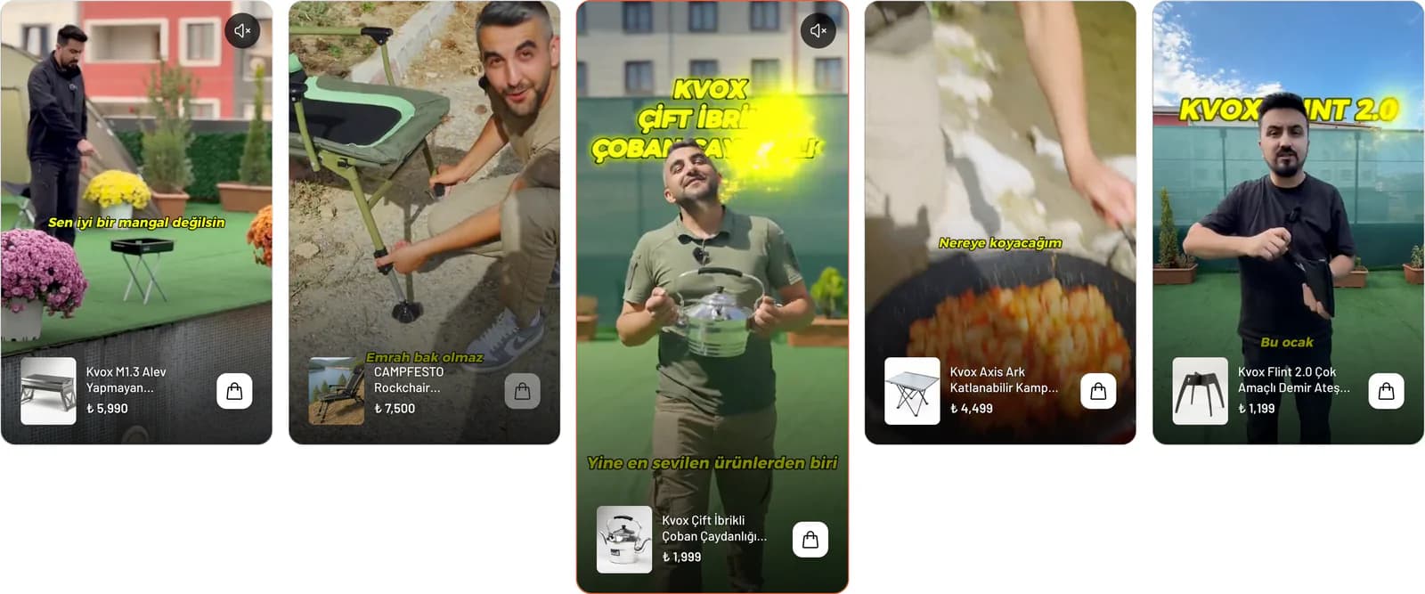
For customers who do not yet know what to buy, we used visual scenes, videos, and story style content. We designed the store as a discovery space where new equipment could be noticed while browsing, rather than as a structure that worked only through a search box and category menu.
On the product page, we focused less on adding information and more on arranging the order of the decision.
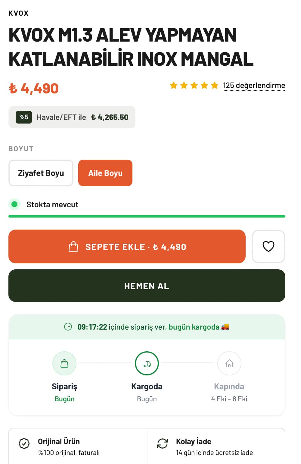
Choosing outdoor equipment often comes down to a series of small questions. Which model is suitable, which size should be selected, is the product in stock, how will delivery work, what are the return conditions, and does the difference between two versions actually matter in real use?
We designed the product page so these questions could be answered within the same flow as much as possible. Beside large product images, we placed the brand, reviews, options, stock information, and purchase area together. We explained the ordering process in clear steps and kept trust elements such as original products, easy returns, and secure payment close to the area where the purchase decision is made.
We made it easy for customers with further questions to move to the support channel and placed related products further down the page. In this structure, customers do not need to keep moving between different pages simply to collect the basic information they need while considering a product.
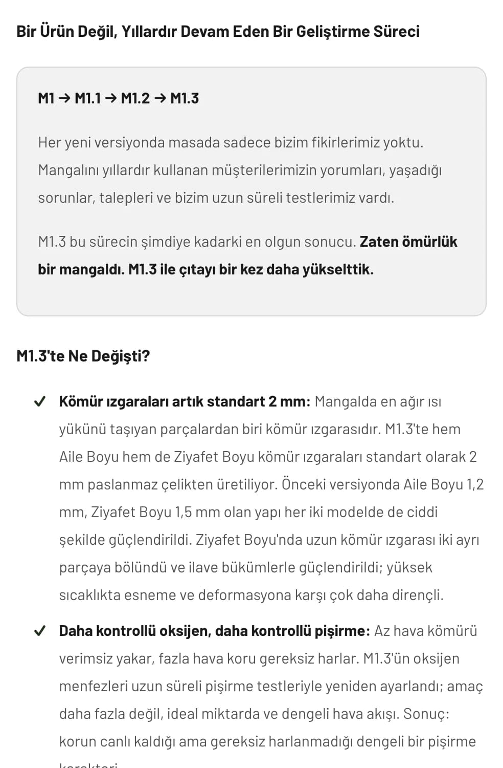
For products that required more explanation, we did not settle for a standard description of a few lines. We divided the product's development process, the points that changed between versions, and what those changes meant in real use into separate sections. After answering “What changed?”, we created an information sequence that also answered “What does this change mean for me?”.
To prevent this approach from becoming inconsistent as the number of products increased, we also established a shared AI assisted content structure. We organized product information, description sections, and frequently asked questions according to a similar logic. When customers browse products across different categories, they do not have to learn a new page structure every time they look for information.
We used video not as extra content added to the showcase, but as another path into the product.
Some characteristics of camping equipment are difficult to communicate fully through photography. How a product opens, how it is assembled, its scale, or the amount of space it occupies in a real environment can be easier to understand in motion. For that reason, we did not confine videos to a separate media section at the bottom of the page.
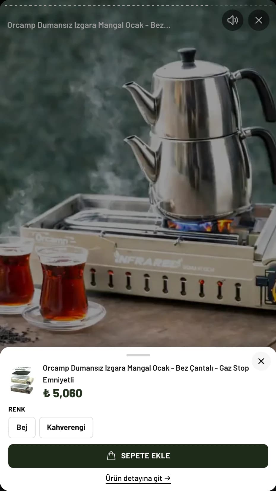
We created a dedicated area on the homepage for discovering products through video. We connected each video to the relevant product so customers could continue from what caught their attention. We also arranged story style content around the habit of quickly moving through short pieces of content, particularly on mobile devices.
At the same time, we did not let the weight of video become a burden on the rest of the store. We prepared large visuals according to where they would be used, reduced video file sizes before adding them to the store, and prevented content further down the page from loading unnecessarily before the customer approached that section.
We did not evaluate performance only by how quickly the first screen appeared. As customers moved down the long homepage, we wanted upcoming content to be ready while avoiding unnecessary data use for images and videos they had not yet reached. On mobile in particular, we worked to preserve both visual richness and browsing speed.
We prepared a structure that would not lock the store into the same page when the camping season changed.
The content that needs emphasis in an outdoor store does not remain the same throughout the year. Tents, tables, and chairs may take priority during one period, while camping stoves, fire equipment, or another product group may become more important at another time. For this reason, we did not lock the main homepage showcases into a fixed arrangement.
We prepared category showcases, story cards, brand areas, text, and core content sections so the store team could manage them through ikas. When a campaign changes, featured areas can be refreshed, seasonal showcases can be reordered, and content can be updated.
We kept the same approach after the store went into use. We added new ways of presenting products as discovery needs emerged, reduced distracting areas around the cart, and introduced new sales areas without separating them from the rest of the design. We also developed sections that helped customers discover products together within camping scenes as new needs became clear through use.
For Kamp ve Ötesi, instead of making an already large catalog feel even larger, we created paths through it.
The project was not centered on a single homepage design or one product template. We started by accepting that someone looking for a tent, someone researching a barbecue, someone exploring a ready made camping set, and someone trying to reach a product they saw in a video could all use the same store in different ways.
That is why we carried the same idea throughout the custom ikas theme, from discovery areas on the homepage and category structure to product storytelling and video use: we wanted customers to first understand what they needed, then reach the right product group, and finally find the information required to make a decision without unnecessary effort.
For Kamp ve Ötesi, the result was not an outdoor e-commerce site where products were simply lined up one after another, but a structure where an extensive range could be explored around different camping needs. New products can be added within the same system as the catalog grows, seasonal showcases can be rearranged when priorities change, and customers can find a suitable starting point regardless of the intention that brings them to the store.