

We measured the decision journey before redesigning the store.
For Waterfall, we did not begin the design process by immediately drawing screens. We reviewed the existing store section by section on mobile and desktop, evaluating touch targets, text readability, page length, visual density, and the path customers followed to reach purchase areas. We documented the findings with screenshots and identified where the new Shopify theme design needed to focus.
This work showed us that Waterfall’s main design challenge was not a lack of content. The store already had strong material covering product benefits, filtration structure, customer experiences, comparisons, and frequently asked questions. Our job was to determine what needed to be explained first and what should come later.
At Waterfall, we started the product story with the water itself.
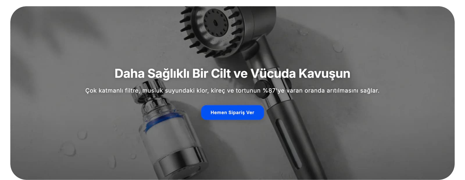
Someone buying a filtered faucet or shower head first needs to understand why the water they use matters, not simply what the product looks like. Instead of opening the journey with product details, we began with the need for filtered water. We treated the benefits for skin and hair, how the filter works, and everyday use as parts of the same story.
We did not place the content side by side as independent sales messages. We first explained the problem, then showed how Waterfall products approached it, and positioned purchase areas at natural points in the story. Rather than introducing a new subject in every later section, we created a sequence in which customers gradually learned more about the same product.
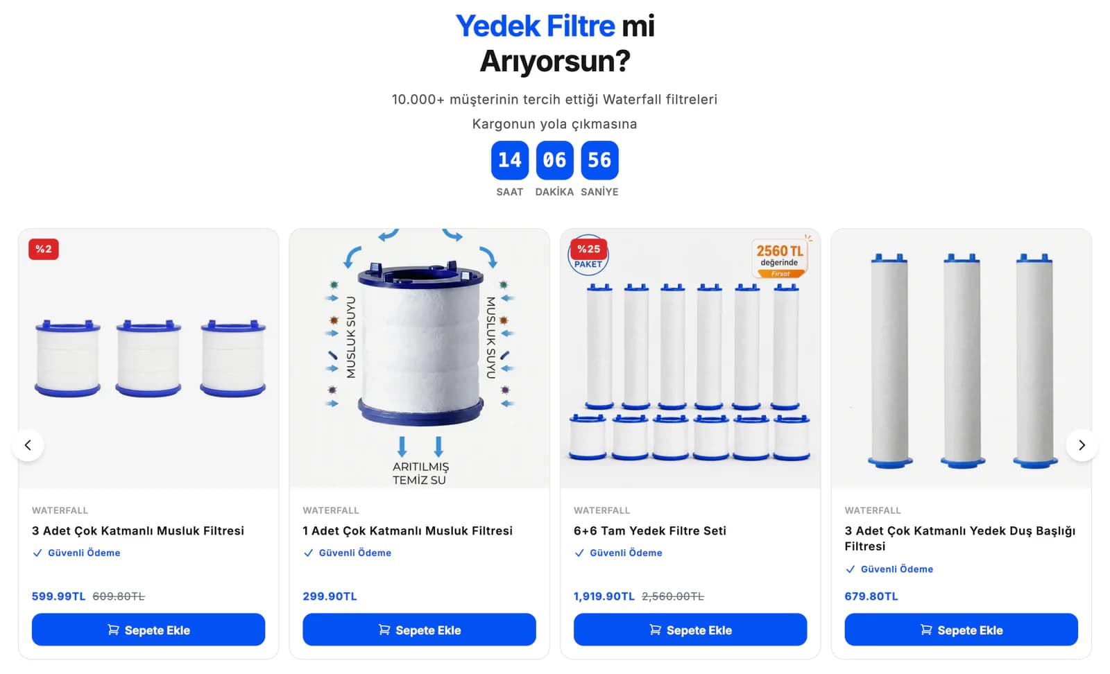
We kept the main product and replacement filters connected.
With Waterfall’s product structure, the shopping journey does not end when the main product is purchased. Replacement filters remain an ongoing part of using the filtered faucets and shower heads. For that reason, instead of treating replacement filters as a separate product group within the store, we positioned them in relation to the main product experience.
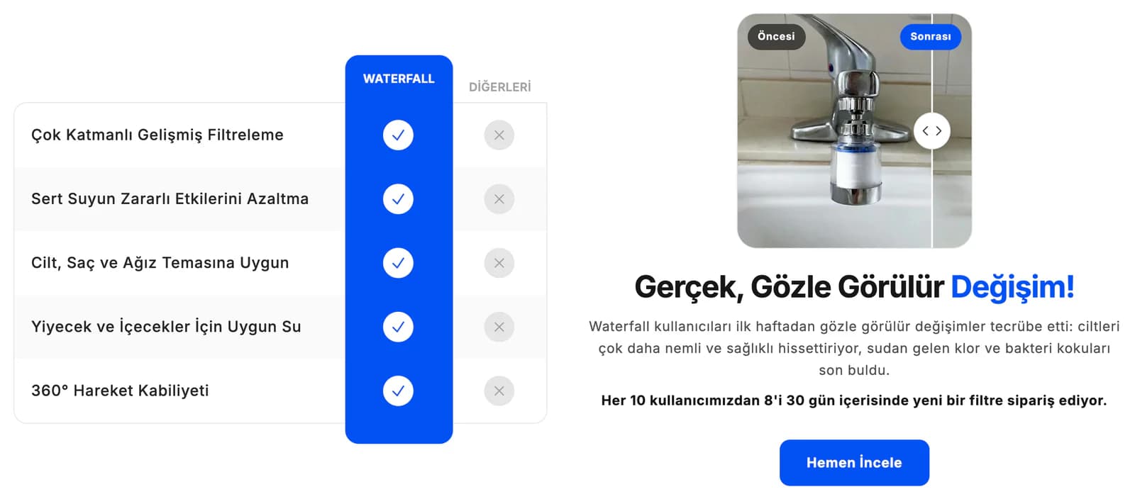
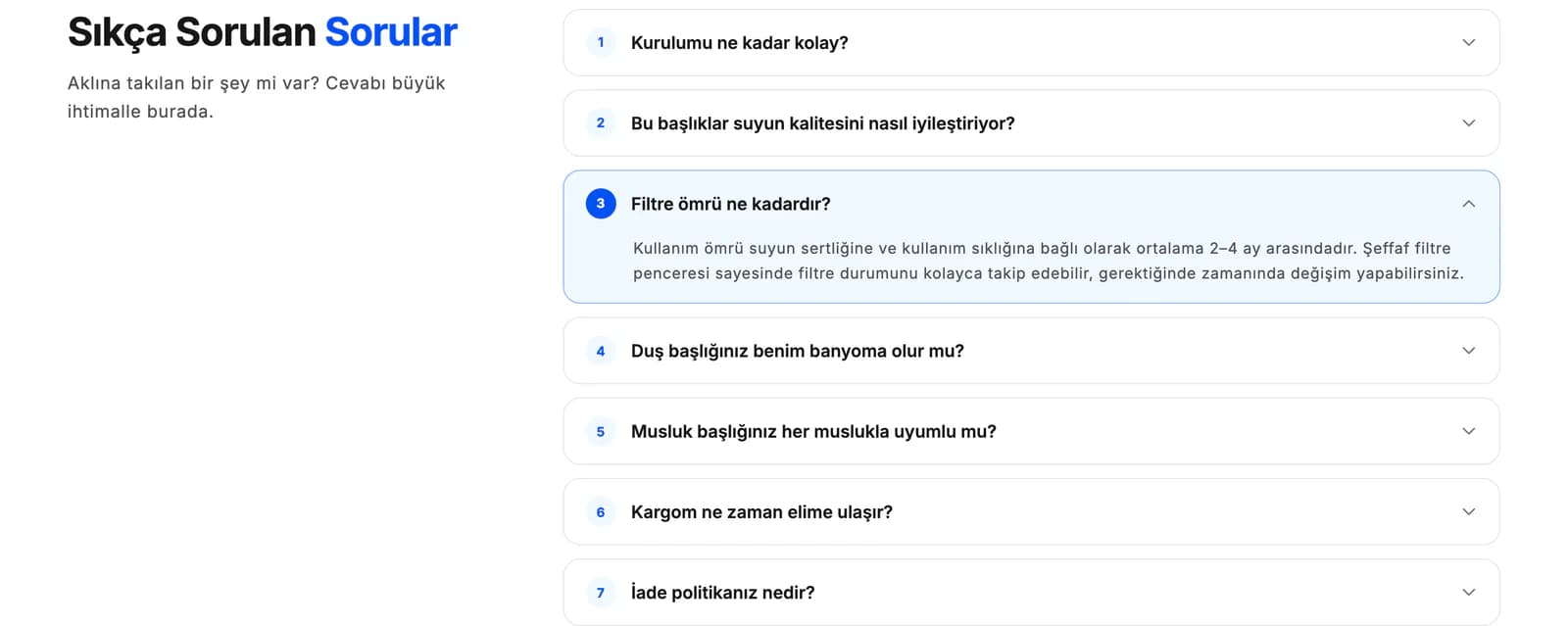
We reorganized the homepage comparison, customer experiences, replacement filter area, and frequently asked questions, along with product page benefits, usage features, and filtration explanations, according to their importance. We reduced repeated messages and explained what the product does more clearly in the opening sections. Someone researching the main product could also understand the need for replacement filters in the right context without being pulled away from the purchase decision.
We made the feeling of cleanliness part of the visual language.
Waterfall’s products are directly connected to water, personal care, and home use. We built the visual language around that same world. We used more space around product imagery, divided long blocks of text into shorter pieces, and treated real usage content as part of the product presentation rather than something separate from it.
In the visual sequence, we placed the main benefit first, followed by the product and then the evidence supporting that story. Someone scanning the page quickly could understand the core message in a short time, while someone who wanted to research further could continue into filtration details, usage features, customer experiences, and frequently asked questions.
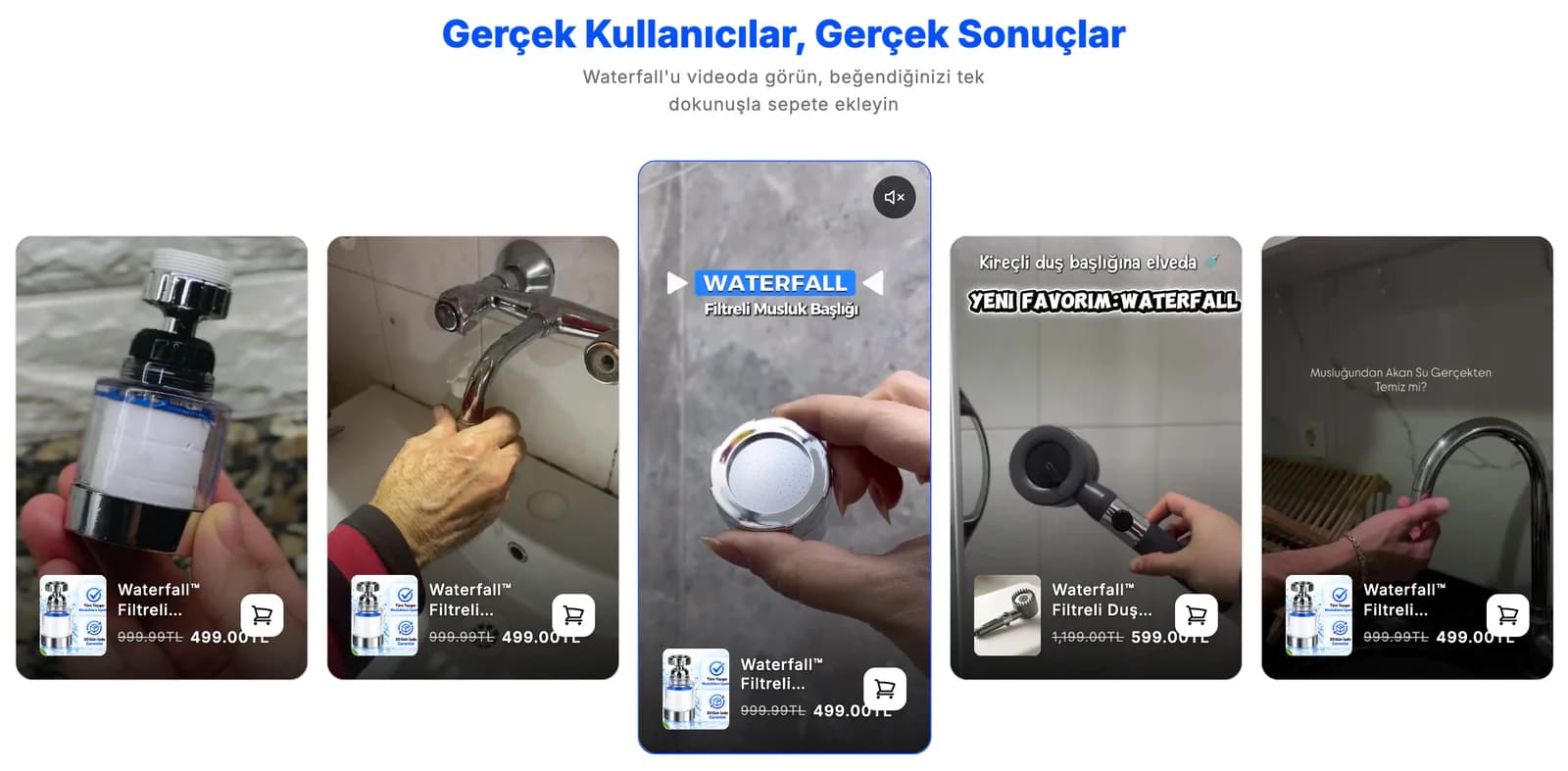
We used customer videos as proof, not decoration.
Real usage footage and customer feedback were important parts of Waterfall’s product story. Rather than repeatedly distributing homepage videos and product page reviews throughout the design, we grouped them into areas with specific purposes.
We gave videos the role of showing how the product is used in real life. Customer reviews were positioned as a separate layer of trust beyond the brand’s own messaging. Together with comparisons and frequently asked questions, these elements created a structure that allowed customers to form their own assessment of the product.
We shortened the search for information on mobile.
The goal of the mobile design was not simply to stack the desktop sections vertically. Waterfall’s product pages contained many layers of information, from product imagery and key benefits to how the product works, filtration explanations, reviews, and results. Instead of carrying all of that into mobile in the same order, we regrouped the content and created a shorter decision path.
We reconsidered touch targets and text sizes and increased the visibility of the price and purchase area. We grouped related topics under the same sections and reduced elements that created a sense of repetition across the long page. Customers who were ready to buy could reach the action more quickly, while those still researching could move into the details at their own pace.
We gave every image and video a specific job.
During the initial measurements, we also evaluated the total load carried by the page. We looked at the long page structure, the number of visuals used, and content that repeated the same idea in different forms. In the new design, we grouped similar subjects within the same sections and selected which images or videos genuinely contributed to the story.
We used product imagery to introduce the product, usage videos to demonstrate the experience, customer reviews to support trust, and explanatory areas to describe how the product works. Instead of reducing content at random, we clarified the role of every element on the page.
Along with the design, we delivered the reasoning behind it.
We approached the Waterfall project in two parts. In the first, we prepared a measurement report that documented the mobile and desktop store experience with visuals. In the second, we translated those findings into the new store structure and screen designs.
This allowed the Waterfall team to review not only the screens we prepared, but also the reasoning behind decisions ranging from content order to the placement of purchase areas. The date for applying the work to the live Shopify store was left to Waterfall’s own publishing plan. We built the resulting Shopify theme design around a single system that began with measurement, simplified the communication of product benefits, moved real usage content to the right places, and reorganized the customer decision journey from beginning to end.